Grid Designer
http://www.freese-works.com/griddesigner
5/1/2024 – Beta22
Create and Use Project Libraries
Add/Delete Rows or Columns Tool
Substitute colors in selection
Loading a pattern from the library
Grid Designer
Introduction
The Grid Designer can be used to create and edit any colored grid-based craft design. Some of its uses include:
· Multi-color knitting
· Multi-color crochet
· Corner-to-corner (C2C) crochet
· Granny Square Crochet
· Latch Hook rug-making
· Diamond Painting
· Square or rectangular patch quilting
· Cross-stitch embroidery
The Grid Designer is free to use . Your designs may be saved to the local storage of the browser you are working in. There is no login required . The link to the designer is: http://freese-works.com/griddesigner . The link to the home page for my blog is http://freese-works.com .
You may create a grid of up to 500 x 500 cells for each design. The cells of the grid can be either square or rectangular to correspond to whatever craft you are interested in. Multiple display options, such as numbering and mouse position, aid in working with your grid. Zoom in and zoom out are available as well as a zoom-full-picture that will size the grid to just-fit the editing window so that the complete design is visible.
The drawing tools include a pencil and eraser, for free-hand drawing, as well as a line tool, shape tool, fill tools, outline area tool and text tool. Line size can be modified from 1 to 10 cells in width, to make drawing on larger grids easier. Undo/Redo is unlimited for all drawing tools.
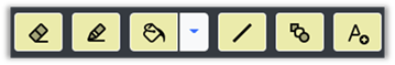
Figure 1 : Drawing Tools
The shape tool allows the creation of simple shapes such as rectangles, circles, triangles, hexagons, diamonds, etc. These shapes can be created as solid shapes of a single color, outlined shapes where only the outline is drawn, or filled shapes with an outline of one color and fill of another color.
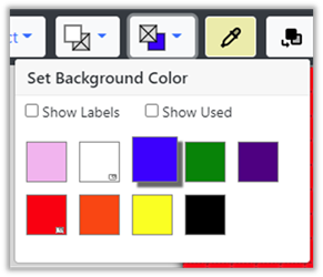
Drawing tools use the selected foreground and background colors which are shown on the top toolbar. Foreground color is usually the color used to draw, while the background color is used to fill the grid initially and to erase with.
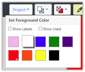
Figure 2 : Color Selection
You may also open a Floating Palette from the Display > Show Floating Palette option. This places a moveable window containing the foreground and background color selections. You may select foreground and background colors from the Floating Palette instead of using the foreground and background dropdowns on the top toolbar.
Select colors from many pre-defined palettes or add your own colors to any palette. Pre-defined palettes include many commonly used yarns, rug yarn, embroidery floss, etc. One custom palette is also provided where you can add any colors you would like to work with.
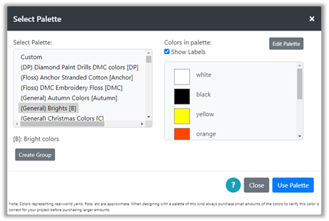
Figure 3 : Palette Feature
Complete support for selection , cut, copy, paste within the tool is provided. In addition, the paste contents can be modified with a series of tools that allow you to flip vertically and horizontally, invert colors, and rotate.
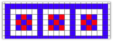
A library of small patterns that can be copied into your larger design is also available.
Color substitution is available, to aid in converting a design from one palette to another or just to switch one color for another in your open project.
|
Figure 4 : Ready to substitute |
Figure 5 : Substitute white for blue |

Projects can be created from scratch, by selecting either the Project à New Project option or the Project à Create from Image option.
The Project à Create from Image option has a full digitizer to convert any image/photo to a digitized pattern.
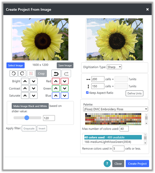
Figure 6 : Create from Image Digitization
Default Project
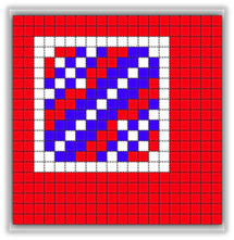
When the designer is opened, a default project is created. This project contains a grid of 20 x 20 cells where each cell is square. The “Brights” palette is automatically selected and the background filled with red. The default project makes it easy to get started editing right away. Use this project for practice with the drawing tools.
This project can be reloaded anytime by selecting the Project à close option or pressing the refresh button in your browser’s toolbar. The refresh button may clear other areas of the editor, such as the currently loaded image in the Create from Image option. Use the Project à close option in this case.
Supported Browsers
The following table shows browsers and the operating systems they are supported on:
| | MS Edge | Chrome | Firefox | Opera | Samsung Internet | Safari |
| Windows * | Yes | Yes | Yes | Yes | N/A | N/A |
| iOS ** (iphone/ipad/mac) | Yes | No | Yes | No | N/A | Yes |
| Android tablets/phones *** | Yes | Yes | Yes | Yes | Yes | N/A |
* -- Tested on Windows 10, should work on browsers with recent windows operating systems.
** -- Tested on iphone 10X, ipad, mac
*** -- Tested on Samsung Galaxy tablet and Google Pixel 4 phone
Internet Explorer will not be supported, as Microsoft is no longer making changes to it and is not supporting it.
I will consider other browsers and operating systems, if there is something specific that you would like to have supported. Please leave me a comment if you have a suggestion.
I am currently working on Android and Iphone apps. Please check back if you are interested in having an app.
Working on a phone or tablet
In general, I expect most users to work on a desktop computer, as this provides the necessary screen space to view and edit designs. However, I am supporting iPad, iPhone and Android devices. See the previous section for browser support on each device.
When working on a tablet or phone, note that the top and bottom toolbars scroll side-to-side to allow you to reach and select all of the tools available on them.
Currently, your projects are saved in the memory of the browser you are using. If you save a project on your desktop computer, it will not be available on your iPad later. A saved project is available only on the platform and with the browser that you were using when you saved it.
I will eventually be working on saving projects to the cloud so you can access them from any device.
To move projects from one browser/platform to another see the share option and the export/import options .
Project Menu
On the upper left of the top toolbar, you will find the Project menu. This appears as a button labeled project with a dropdown arrow on the right. Click the project menu button and you will find the following options:
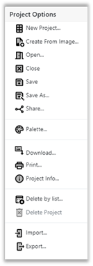
Figure 7 : Project Menu Options
The New Project and the Create from Image options are used to create new projects. Use New Project to define the grid size, cell size and palette for a new project. Use Create from Image to create a project from a jpg or other image file.
To Save your project, use the Save or Save As options. Any project you save can be opened again with the Open option. Projects can also be shared with others using the Share option. The Delete Project option deletes the currently open project and the Delete by List option presents you with a full list of all your projects so that you can delete old or unused projects.
To change the color palette for your project, use the Palette option. This option also allows you to edit palettes and convert an existing drawing to different palette.
Your project grid diagram can also be downloaded to an image file with the Download option or printed with the Print option.
To see the current project’s information, such as grid size, cell size and colors currently used, select the Project Info option.
To export and import your projects to and from files on your local file system, use the Export and Import options at the bottom of the project menu. These can be used to make a backup file of your projects or to create your own library of projects.
These features will be discussed in detail in the following sections.
New Project
The Project à New Project option opens the New Project Layout dialog shown in Figure 3.
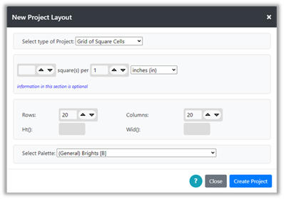
Figure 8 : New Project Layout Dialog
This dialog allows you to select the project type, define the size of that project’s grid and select a palette for your project. Make selections for your project, as described in the following sections and then click the Create Project button to create your project grid.
Project Type
Select the type of project you are working on from the “Select Type of Project” dropdown:
· Cross-stitch embroidery
· Latch-hook rug-making
· Knitting
· Crochet
· Corner-to-corner (C2C) crochet
· Granny Square Crochet
· Diamond Painting
· Quilting with squares
· Grid of Square Cells – use if your project type is not available and you expect to work with square cells, i.e. height equals width for each cell.
· Grid of Rectangular Cells – use if your project type is not available and you expect to work with rectangular cells, i.e. height is different from width for each cell.
Once the project type is selected, the dialog will change to show more options for that project type. For instance, if Cross-stitch is selected as the project type, you can select from pre-defined settings as shown below, or you can enter your own sizing information in the form of number of stitches per inch or cm.
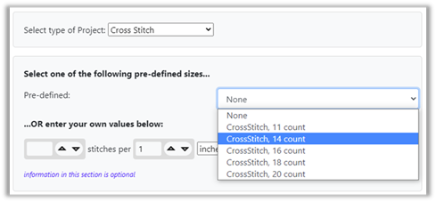
Figure 9 : Selecting Project Type
Follow directions on screen for the project type you have selected.
Enter Rows and Columns
The next section of the New Project Layout dialog allows you to enter the number of rows and columns for your grid. If you have entered information for the project that defines the real world size of the project such as in inches or cms, the Height and Width will be calculated for the project and is shown below the Rows and Columns.
For example, suppose we select cross-stitch and 11 count fabric. This tells us the relationship between your project grid and real-world measurements of inches, because 11 count Aida cloth will have 11 stitches per inch. Then, the size in inches can be computed as you change the number of rows and columns. See the figure below; 50 rows and columns of stitches will be 4.545 inches or a little over 4 ½ inches.
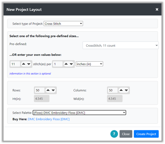
Figure 10 : New Project Size Calculation
If no sizing information is provided in the section above Rows and Columns, then the Ht and Wid fields will be blank.
Select Palette
The final section of the New Project Layout dialog allows you to select a palette for your project.
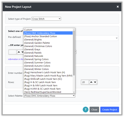
Figure 11 : Selecting Palette for Project
General palettes represent convenient groupings of colors, but do not correspond to any particular type of yarn or floss. Other palettes correspond to specific real-world yarns or flosses. Types are indicated in the menu. Rug – indicates pre-cut latch hook rug yarn. Yarn – indicates yarn (currently only medium-weight yarns are represented). Floss – indicates embroidery floss.
Changing the Palette
By default, the “Brights” palette is selected and opened with the default project. You may select a palette when you create a new project either through the Project à New Project option or through the Project à Create from Image option. You may also change palettes at any time while working and the Grid Designer will allow you to select the existing colors and substitute colors for them from the new palette.
Selection and modification of color palettes is done by selecting the Palette option from the Project dropdown menu (Project à Palette). The Select Palette dialog will be displayed.
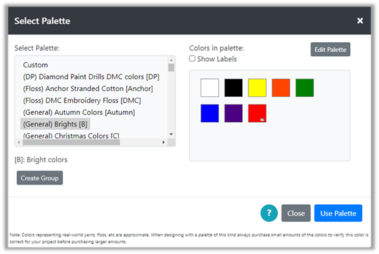
Figure 12 : Select Palette Dialog
On the left is a list of existing palettes. The colors contained in that palette will be displayed in the panel on the right side. You can browse through the palettes by selecting each one and viewing its colors.
Palettes currently are available in the following types:
· Rug – colors from popular pre-cut latch hook rug yarn
· Yarn – colors from popular yarns (currently only worsted weight is represented)
· Floss – colors from embroidery floss (currently DMC and Anchor are represented)
· General – colors following a particular theme that are not associated with a particular yarn or floss.
· Custom – An empty palette you can add your own colors to.
NOTE: All palettes can be modified. You can add new colors and hide existing colors. For more information, see the Modifying a Palette section .
Color labels can be shown by clicking the Show Labels check box above the color list. You can search for colors in the list using the browser’s text search for the page. Often this is initiated with Ctrl+f.
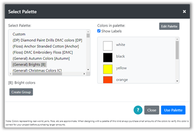
Figure 13 : Select Palette Dialog with color labels shown
To change your project to a different palette, simply select the palette on the left that you want to use, then click the Use Palette button on the bottom right.
The Grid Designer will look to see what colors are currently used in the grid you are working on. If those colors are not found in the palette you have selected, the following dialog will be displayed:
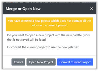
Figure 14 : Merge or Open New Dialog
You can create a new empty project with the new palette, or you can convert the existing colors in your project to the new palette by selecting colors to substitute for the old colors.
NOTE: Both of these actions are NOT undoable. If you want to save any current work, click the Cancel button and save your project before you change the palette.
Selecting Open New Project will clear the current grid and automatically select a foreground color and a background color from the new palette. You can change these manually.
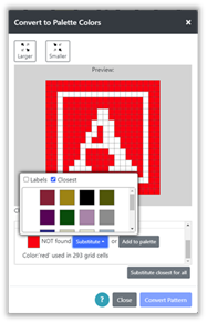
Selecting Convert Current Project will display the Convert to Palette Colors dialog:
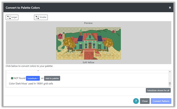
Figure 15 : Convert to Palette Colors
This dialog will list each color used in the grid and provide options for each color as follows:
1) If the color in the current grid is found in the new palette , you may keep the color the same or substitute another color for it.
2) If the color in the current grid is NOT found in the new palette , you may add the color to the new palette or substitute another color for it.
You can make the preview picture larger or smaller with the buttons on the top right. On the bottom left is a button labeled “Substitute closest for all”. Clicking this button will substitute the closest color in the new palette for every color used in the old palette that is not already found or is not already substituted. This is particularly useful for projects using many colors.
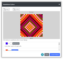
Example
Example
In the figure above, there are only two colors in the grid, red and white. White was found in the new palette that we have selected; red was NOT found in the new palette we selected.
Suppose first that we want to keep the colors as close as possible to the original. We would keep the white alone, as it can be the same color with the new palette.
To change the red color to one that is in the palette, we click the Substitute button. A popup will be displayed with all the colors in the new palette.
We select the color we would like from the popup. In the picture above, we have selected the Closest checkbox to order the colors according to which is closest to the original color. The Preview picture is updated to show that color substitution:
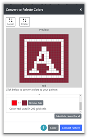
Note that there is also a button labeled “Substitute closest for all” on the lower right. This button will select the closest color in the new palette for each color that is not found, or not already substituted. This button can be very useful when there are a lot of colors.
Suppose we want to completely change the color scheme. We want the picture to contain a blue letter on a white background. We click the Remove Sub button to remove the current substitution for red.
Then, we can substitute a blue for the white and a white for the red and the preview will show the result.
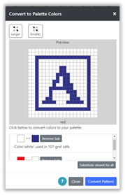
When we have the preview picture as we would like it, we click the Convert Pattern button. The grid is updated to show the picture with the substitutions. If we have substituted colors for the background and foreground, then the background and foreground selections are updated also.
Note that white is now selected for the background color and blue is now selected for the foreground color in the top toolbar.
NOTE: You can also substitute colors without changing the palette, by selecting the Substitute Colors button on the top toolbar. For more information see section Working with Colors > Substituting Colors .
Create Project from Image
You can create a project by digitizing an image.
To digitize an image:
1) Select Project à Create from Image option. The Create Project From Image dialog will be displayed.
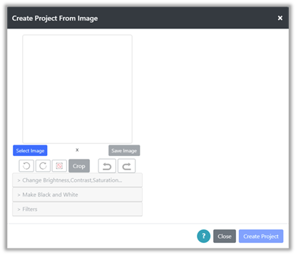
Figure 16 : Create Project From Image Dialog
2) Click the Select Image button to browse for an image on your device. On my Windows 10 machine with the Chrome browser, the Open dialog is shown and I can browse for and select a picture.
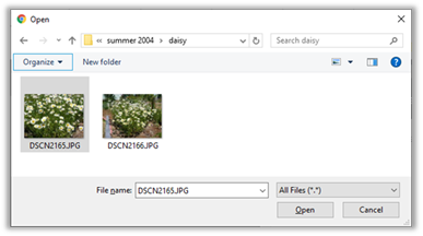
Figure 17 : Select Image File
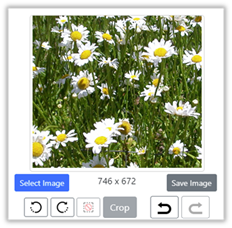
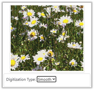
3) Select an image file to use. In the picture above, I have selected a picture of daisies. Then I click the Open button to complete the selection. The image will be loaded and more options will be shown in the Create Project From Image dialog.
4) To begin digitizing the image, select a palette from the options on the right-hand side. Now your image will be digitized with colors from that palette and the digitized picture will appear on the upper right-hand side.
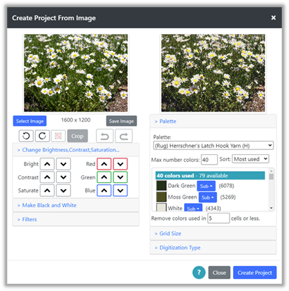
Figure 18 : Daisy Image Loaded
5) Below the loaded image on the left are options to modify the image. You may rotate, crop, change brightness, contrast, saturation and red/green/blue values in the image. You may also create a black and white image based on a threshold value that can be adjusted through a slider. You can also create a grayscale image, invert the colors, sharpen, blur and emboss the image using filters as well as add shading to the edges of the image.
Changes to the original image are undo-able. Click the undo or redo buttons to move back and forth in your changes. If you like changes you have made to your image, you may save a copy of it with the Save Image button. This allows you to reload the modified image at a later time to continue where you left off.
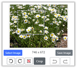
6) You may crop the picture by dragging the mouse over the picture to select a rectangular area. Note that the picture size updates to show the size of the crop area (e.g. 746 x 672 below). Click the crop button to crop the image to the selection.
If you are on a phone or tablet , click to establish one corner of the selection then click to define the opposite corner of the selection. Select the Crop button to crop the image to the rectangle. The digitized image on the right will update also.
|
Figure 19 : Before Crop |
Figure 20
: After Crop |
7) Options below the digitized picture on the right allow you to affect how the image is digitized.
a. The first section below the digitized image allows you to select a palette, modify the number of colors used, turn colors off/on, lock colors you want to be used, and substitute one color for another.
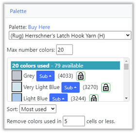
Figure 21 : Select Digitization Palette
i. Select the palette you want to use, then adjust the max number of colors used as you wish. You may also reduce the number of colors that are used in only a few cells by adjusting the “Remove colors used in X cells or less” number. This will remove trailing colors that might be used in only a couple of cells. The default value here is 5, but you can increase the number to anything you like.
ii. The list of colors below the palette selection shows the current colors selected from the palette by the digitizer. The list of currently used colors can be sorted in different ways: Most used/Least used as well as A-Z and Z-A.
iii. You can modify this list in three ways:
1. You can turn a color off in the list by clicking on the colored box for the color. You can turn it back on by clicking it again. (Note that colors may move around in the list when you turn them on and off, depending upon the Sort option on the upper right of the color list.)
When you turn a color off, it is the same as removing it from the palette, with respect to the digitizer.
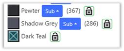
Figure 22 : Dark Green Off
2. You can substitute other colors from the palette for any color in the list. The picture below shows selecting a substitute color for Dark Green.
When you substitute a color for another, the digitizer still uses the original color to digitize, but wherever it finds a use for that color, it will use the substituted color in the final digitized picture.
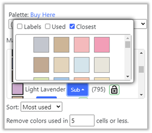
Figure 23 : Substituting color for Light Lavender
3. You can lock a color to force the digitizer to use it . This is useful when you are trying to reduce colors, but a specific color you want to be used is being removed by the digitizer, when you reduce the number of colors. To lock a color, select the lock on the right side of the color when it appears (usually when the number of colors is larger). The lock will turn green, indicating it will not be removed by the digitizer as you reduce the number of colors.
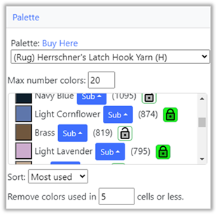
Figure 24 : Locked Colors
b. The next section below Palette allows you to size your project grid. (Click on the Grid Size link to open this section). If you have not entered any sizing information for your project, you will see “?units” displayed in this section. You may continue to size your project by changing the number of cells horizontally and vertically directly.
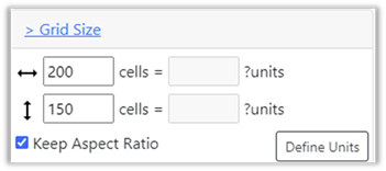
Figure 25 : Defining Digitized Grid Size(no units defined)
However, if you want to size your project in inches or centimeters, you will need to define the type of project you are working on and the size of cells in inches or cms. To do this select the Define Units button.
i. The Define Units button will bring up the Change Cell Size dialog where you can select your project type and sizing information. For instance, if you are working on a latch hook project, you would click on the Define Units button, select Latch Hook for project type and then select your canvas type.
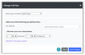
Figure 26 : Define Units
ii. Click on Save Changes when you are done and you will be returned to the Create from Image dialog. The grid size information will now be updated with size in inches (or cms). At this point you may enter either number of cells or number of inches for your project.

Figure 27 : Units defined
iii. As you change the number of cells or the number of inches/cms, the other values will be recalculated. As long as the Keep Aspect Ratio is selected, the ratio of the height to width of the digitized image will remain the same as the original image.
iv. If you unselect Keep Aspect Ratio and modify the values, the digitized picture will be stretched or shrunk to fit within the values you define. This allows you to fine tune the final size of your project. For instance, in the Figure above, if you wanted your project size to be exactly 40 x 32 inches, you can unselect Keep Aspect Ratio, and then change the 32.200 value to 32.0. This will remove one row and shrink the image slightly in the vertical direction to fit. Small changes such as this will be unnoticeable in the final project.
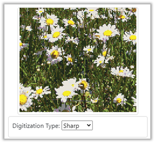
c. The last section on the right side of the dialog allows you to change the digitization type, either “Sharp”, “Smooth”, “Block”, “Dithered/Smoothed” or “Dithered/Pixelated”. Click the Digitization Link to open the section. Try your picture with each one to see which you like best with your image.
For detailed images and photos try “Sharp” or “Smooth”:
|
Figure 28 : Sharp Digitization |
Figure 29 : Smooth Digitization |
For images that contain a gradient of colors, such as the sky at sunset or any type of shading or fading of a color, select one of the Dithered options to capture the subtle change in colors across an area.
For instance, here is a sunset first done with the Smooth option, then done with Dithered/Smooth:
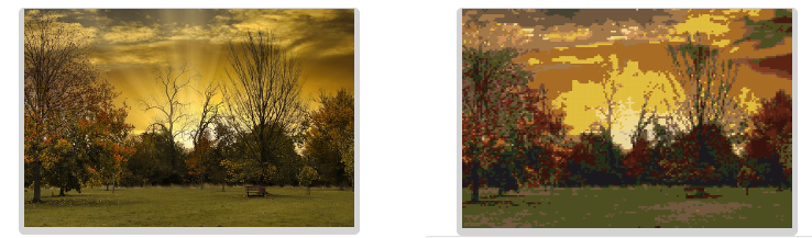
Figure 30 : Sunset with Smooth option
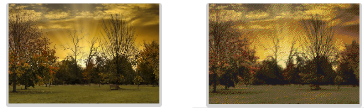
Figure 31 : Sunset with Dithered/Smooth option
For simple drawings with areas of solid colors try “Sharp” or “Block”. I find that “Block” seems to give the best shape to a single-color object, but sharp can pick up more details that “Block” does not draw. “Smooth” will create a fuzzy edge to drawings like this which is usually not desirable.
|
|
|

Table 1 : Block vs Sharp
Grid drawings can be imported, depending upon the quality of the grid image. On the left of the figure below, is a rainbow I created in design-a-knit. Setting the number of horizontal cells to the exact number of cells in the grid and making sure the image is trimmed to contain only that grid will allow you to import a grid. Using block in the case below works best, as block looks for the most common color in an area. Block is able to find the colors around the lettering in the grid.
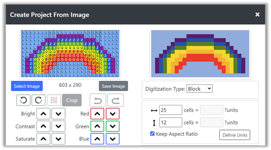
Figure 32 : Importing a grid with block
8) Click the Create Project button when you are ready. A “Processing Image” message will appear at the bottom of the dialog and then the project will be created and the dialog will be removed. If the cell size of the project is small, the grid lines will be turned off in order to better view the final result. You can turn them on again with the Display à Show Grid option if desired.
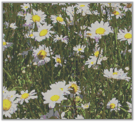
Figure 33 : Digitized Image
9) If you want to change settings and reprocess the image, you may select the Project à Create from Image option again and the same cropped image you just processed will be there to reprocess with a different palette, etc. Once you refresh the browser page or close and reopen it, the image will be gone from the dialog. You can save an image for later by clicking the Save Image button under the loaded image on the left side of the dialog.
Tips for Working with Images
Here are some tips for using images to create a project:
1) The Grid Designer contains palettes that contain color representations of yarns and floss. These color representations and how they are viewed by a designer is dependent upon a lot of variables. The colors viewed may appear differently on the screen than they would if you had the yarn or the floss immediately in front of you. This is because any variation in lighting when the yarns were photographed, the quality of the camera, or a variation in the brightness of your screen, etc. can affect how a color looks.
Always keep this in mind when purchasing colors for a large project. Purchase a small amount of the colors you believe you need and verify that they look good together before purchasing large amounts for a project.
2) After digitizing the project, you can view the colors used in the project by going to Project à Project Info. This will show the number of colors used and the number of cells each color is used in.
3) To continue editing the project manually with only the colors used in the image, select the Show Used option in the dropdown for Foreground or Background color to reduce the list to only those colors currently used.
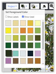
Figure 34 : Select Show Used to see only color currently used in grid
4) Once you have created your project, you can do substitutions of one color for another by clicking the Substitute Colors button on the main toolbar. This will bring up a dialog where you can see what colors are used and how many cells, they are used in. You may then substitute one color for another.
5) You may restrict the colors chosen by the image processor, by hiding colors in the palette you are using. For instance, the DMC embroidery floss palette has almost 500 possible colors. To restrict this palette to colors that are more relevant for the image you are using, you may edit the palette under Project à Palette. For instance, you might edit the DMC palette, select the Hide All button, and then Show only those colors you would like to use in the digitization of your image. When the DMC palette is later selected in the Create Project From Image dialog, it will use only the colors you have selected to Show in the palette. This type of restriction can be done with any palette. To remove your changes later, select the Show All button when editing the palette.
Note: that when modifying a palette, such as to hide colors, you will not be able to make any modification to colors that are currently used in an open project. To edit a palette, it is best to close any open project that uses the colors in that palette. Use the Project à Close option for this purpose.
Saving your Project
Your project grid and the current palette being used can be saved using the Project à Save option.
This data is saved to the local storage of your browser and resides on the computer, tablet or phone that you are using. No login is required for you to do this.
The current name of the project you are working on is displayed in the upper left corner of the screen. You can also see the name by selecting Project à Info. The name will be defined if you have previously saved the project, or if you have opened an existing project.
NOTE: I plan to provide an option in the future to store your project in the cloud so that you can access it from any device.
To save your project for the first time:
1) Select Save from the Project menu. The Save dialog will be displayed.
2) Enter a name in the “Save As” field.
3) Click the Save Project button.
4) Your project is saved. You can verify it is saved by selecting the Project à Open option and viewing the list of your saved projects.
To save your project again, once it has been saved or opened from a saved project:
1) Select Save from the Project menu.
2) No dialog will be displayed , the project will be saved under the same name as previously used. This allows you to quickly re-save your project as you work. You can verify it is saved by selecting the Project à Open option and viewing the list of your saved projects.
You can quickly check to see if a project needs to be saved by looking at the project name in the upper left corner of the screen. An asterisk will appear after the name, if the project has changes that need to be saved.
|
|
|

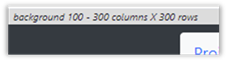
Figure 35 : Checking project status, unsaved (left), saved(right)
If the Save option in the Project dropdown menu is disabled, it means there are no edits or changes to save.
NOTE: Keyboard shortcuts exist for many options in the designer. Ctrl-s or Alt-s will execute the save option. Many of the keyboard shortcuts are visible in the option tooltips. See the Keyboard Shortcuts section for a list of all keyboard shortcuts.
Save As
The Project à Save As option allows you to explicitly provide a name when you save.
To save your project using Save As:
1) Select the Save As option from the Project dropdown menu.
2) If your project already has a name (from a previous save or from opening an existing project), a unique name will be generated for it and placed in the “Save As” field. If no name has previously been used, the “Save As” field will be blank.
3) Edit or enter the name as desired.
4) Click the Save Project button.
5) If a project already exists with the name you entered, you will be asked if you want to replace the project of the same name with your new content.
NOTE: If you receive an error while saving, saying that your quota has been exceeded, your browser’s local storage is full for Grid Designer data. You may delete projects to make more space using the Project à Delete by List option. If you want to save copies of old projects before deleting them to make more space, use the Export option to save the projects to files on your local file system.
Sharing your Project
You can share any project with another user. Shared projects are temporary and may be deleted after 6 months from the creation of the shared link. You may share the link to the project directly with another user, or you may post the link to the project to a social media platform.
To share the currently opened project:
1) Select Project à Share. A small dialog will appear while data is being generated. No action is needed, when it is done it will continue with the share process.
2) The Share Project dialog will be displayed. This dialog explains that a link will be generated to the project information.
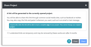
Figure 36 : Share Project Dialog
3) Check the checkbox in the dialog that indicates that you understand that the link you create may be temporary.
4) Click the Share button. The Share Link dialog will be displayed. This shows a link to your project data that may be copied and pasted anywhere you would like it or it can be shared on a social media site.
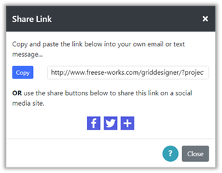
Figure 37 : Share Link Dialog
5) There are two ways to share the link:
a. If you want to share the link directly in an email or text message, copy and paste the link text to the desired place. Clicking the Copy button will copy the text to your clipboard so you can paste it wherever you want.
b. If you want to share the link on a social media site, such as facebook or twitter, click the facebook, twitter, or + icon to select another social media site and follow the instructions for that site.
6) Click the Close button when done.
When the link is used, it will display a page like the following example:
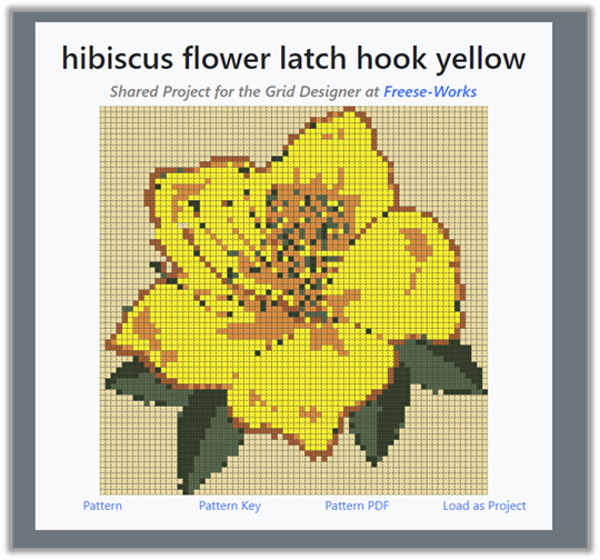
Figure 38 : Shared Project Example
Four links appear under the picture:
· Pattern – opens a png image file with the grid, this can be different from the image you see on the shared project page. It includes numbering, etc. If there are more than 10 colors in use, the pattern image will have symbols for each color.
· Pattern Key – opens a png image file that contains the color key for the pattern image.
· Pattern PDF – opens a pdf file that contains both the pattern image and the color key. This can be used in other tools such as “knitcompanion”, as you work on your project.
· Load as Project – opens a copy of the shared pattern in the Grid Designer. From there you may edit the pattern, download or print it using your own selection of options.
To load a shared project:
1) Click the Load as Project link as shown in the example above. (Clicking the picture in the shared file will also load the project).
2) Grid Designer will be started in your browser and the Load Project dialog will be displayed.
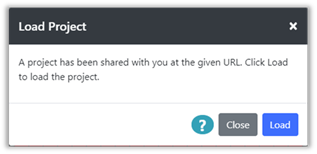
Figure 39 : Load Project Dialog
3) Click the Load button to load the project. A copy of the original user’s project will be loaded into your Grid Designer. View and edit as desired. Save any changes you make in the normal way, with Project à Save or Save As.
Opening a Project
Projects that have been saved, may be reopened using the Project à Open option.
To open a project, you have previously saved:
1) Select the Open option from the Project dropdown menu. The Open Project dialog will be displayed.
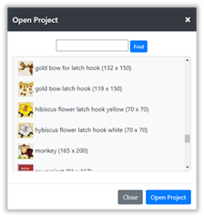
Figure 40 :Open Project Dialog
2) The dialog will show a thumbnail image of each project, the project name, and the project size. Select the project you want to open.
· You may also search for projects in the list by typing in the text box next to the Find button at the top. Then, click the Find button to search for the text in the list. Each time you click the button, the search will move to the next instance of the text in the list. If the text is not found, the text box will show a red border.
3) Click the Open Project button
4) The project is loaded into the grid and the palette set to the palette used when the project was last saved. Foreground and Background color selections are restored to those that were set when the project was saved.
Closing a Project
To close a project, select the Project à close option. A warning will be displayed if your current project has not been saved.
Once your project is closed, the default project will be displayed in its place.
Download your project
You may download the following from the Grid Designer:
· A png file containing an image of the project grid/graph
o This image will be generated with the same settings as for the Print option. See print settings under the More Options section.
· A png file containing an image of the project color key
· A pdf file containing both the graph image and the color key
o Optionally, the pdf file can contain written directions, these are currently available for crochet and general printing of colors for each row in various ways. For crochet you may also download an estimate of the yarn needed for your project.
o The graph image will be generated with the same settings as for the Print option. See print settings under the More Options section.
· An XLSX file for Microsoft Excel containing the graph and the color key
o The XLSX file contains three sheets: the color key, the graph with colors and symbols for each cell, the same graph with no symbols.
NOTE: If you do not like working with the colored graph, writing out directions will provide another alternative. If you are interested in having directions written for other types of graphs, please contact me and let me know what you would like to have .
To download your selection:
1) Select Download from the Project dropdown menu. The Download Image Settings dialog will be displayed.
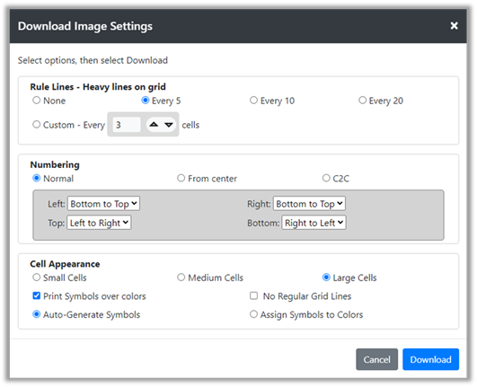
Figure 41 : Download Image Settings dialog
This dialog contains three areas:
· Rule Lines – heavy lines drawn over the lighter grid lines to break up the grid into area. The options here are the same as the options for the Display > Rule Lines option. See the Rule Lines section for more information.
· Numbering – options for controlling the way numbering appears around the edges of the project. Numbering is always shown for printing. The numbering options are the same as in Display > More Options. See the More Options section for more information.
· Cell Appearance – cell appearance can be controlled for printing. The Cell Appearance options are generally the same as shown in Display > More Options. See the More Options section for more information.
o You may also turn regular grid lines on and off with the No Regular Grid Lines checkbox.
Select the options you want for your download image, then click the Download button. The Download Project Image dialog will be displayed.
2) There will first be a message saying it is generating the image data:
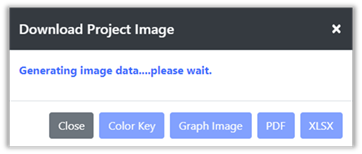
Figure 42 : Generating Image Data for download
3) When it is done generating the image, it will display:
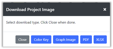
Figure 43 : Ready to download image
4) Select the option you want: click the type of download you are interested in. The browser will handle the download for the Color Key, Graph Image and XLSX file. If the PDF option is selected, another dialog will be displayed, asking what you would like to include in the pdf.
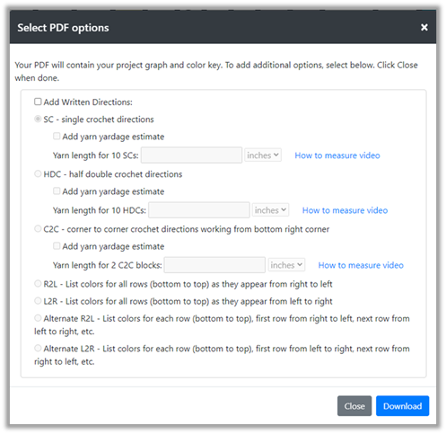
Figure 44 : PDF Options
Select the option you would like and click the Download button. The browser will handle the download to your machine.
If you select to “Add yarn yardage estimate” you will need to do a simple measurement of the yarn used in a small amount of your work. See the directions and videos on https://freese-works.com/get-a-yarn-estimate-for-graphghan-projects page for more information.
5) Click Close to close the Download Project Image dialog if it is still visible after your download.
Print your project image
You may also print your project image.
To print your project image:
1) Select Print from the Project dropdown menu. The Print Image Settings dialog will be displayed.
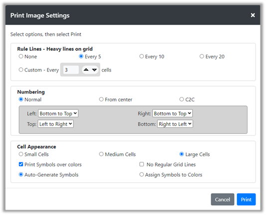
Figure 45 : Print Image Settings dialog
This dialog contains three areas:
· Rule Lines – heavy lines drawn over the lighter grid lines to break up the grid into area. The options here are the same as the options for the Display > Rule Lines option. See the Rule Lines section for more information.
· Numbering – options for controlling the way numbering appears around the edges of the project. Numbering is always shown for printing. The numbering options are the same as in Display > More Options. See the More Options section for more information.
· Cell Appearance – cell appearance can be controlled for printing. The Cell Appearance options are generally the same as shown in Display > More Options. See the More Options section for more information.
o You may also turn regular grid lines on and off by checking the No Regular Grid Lines checkbox.
Select the options you want for your print-out, then click the Print button. The Print Design dialog will be displayed.
2) There will first be a message saying it is generating the data:
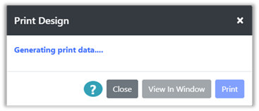
Figure 46 : Generating print data
3) When it is done generating the data, it will display:
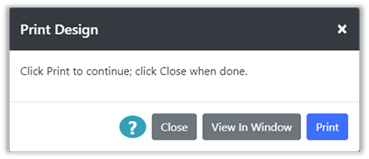
Figure 47 : Ready to Print
4) If you are on a desktop machine, click the Print button to print.
5) This will bring up a browser-specific window from which you can select your printer. In some browsers you can view the pattern to be printed before selecting the final print.
6) If your current browser does not allow you to view what will be printed before printing, or you are using a phone or tablet, you can select the View In Window option.
7) The View In Window options will open a new browser window containing the images to be printed. You may then print them from that browser window using the browser or any utility that you would normally use to print a web page.
8) When you are done printing or viewing the design, click the Close button to close the Print Design window.
If you are working with a large grid, the image will be broken up into multiple pages so that it will fit onto printer paper and the grid will be readable. The resulting pieces can be cut out and assembled together using tape to form a single large grid diagram.
When the grid is printed, numbering will be added to the borders of the diagram for ease of use.
NOTE: You may also use the Project à Download option to download the same image that is printed, without the image being broken up into pages. This image can be printed in any way you choose, including printing at a facility where it can be printed on oversized paper. See the Download section for more information.
Example
Example
If we are using Google Chrome for our browser on a Windows machine. We will see the following when we click the Print button on the Print Design dialog.
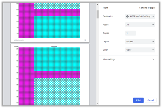
Google Chrome shows the pages that will be printed with the design so they can be reviewed before printing.
Microsoft Edge will also show the pages that will be printed with the design. If we use Microsoft Edge, to print a large project, we will see something like the following:
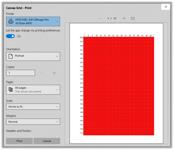
Here there are 12 pages to print. We can review them before printing.
If we are using Firefox as our browser, the pages are not shown as part of the browser’s print support. To see the pages in Firefox, select the View in Window button. This will open a separate window with the images to be printed. The images can then be printed from there.
View Project Information
You can view your project information at any time using the Project à Project Info option or by clicking the project name on the upper left of the screen.
Some project information is always shown on the upper left of the screen. The project name (if set) and the size of the project will show there. If the project is not saved an asterisk will show after the project name. You can click on the project name and size information on the upper left of the screen to display the Project Info dialog.
|
|
|
Figure 48 : Project Info Unsaved (Left) and Saved (Right)
To view project information:
1) Select the Project Info option from the Project dropdown menu or click on the project name in the upper left corner of the screen.
2) The Project Info dialog will be displayed.
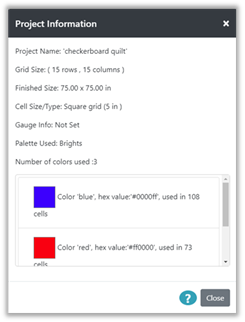
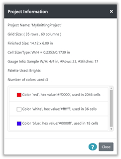
The Project Info dialog displays the following information:
a) Project Name – if the project name is not set, it will display as Undefined
b) Grid Size – shows number of rows and columns in the current grid
c) Finished Size – if the size of a grid cell is defined in inches or centimeters either through directly setting the size on the cell or through defining a gauge, then the finished size of the entire grid will be computed and shown here.
d) Cell Size/Type – Size of each cell will be shown in inches or centimeters, if defined through either directly setting the size of the cell or through defining a gauge. If cells are square with no defined size, it will indicate “Square grid”.
e) Gauge Info – If a gauge has been defined, the information will appear here.
f) Palette Used – Name of palette being used
g) Colors Used – Number of colors used and list of colors currently used in the project with the number of cells using each color.
Example
Example
Here are some examples of how the information appears for different types of projects.
A square grid with the sizes of the squares defined as 5 inches, for a quilting project would look as follows:
A grid that was set up with the default knitting settings for gauge, would look like this:
Export and Import
You can Export and Import your projects to and from files on your local file system. These files can be used as backups for your projects that are stored in browser storage, or they can be used to create libraries of your projects that you can open at any time to access projects.
It is always a good idea to back-up your projects to a local file, in the event there is some problem with your browser and its storage has to be reset or cleared. If you are actively working on projects, it’s a good idea to back them up on a regular basis.
NOTE: The following directions for Export depend upon settings in your browser for handling downloads. Generally, browsers provide a switch in their settings for downloads, that can be turned on to cause the browser to prompt for the filename and folder for the downloaded file. For instance, in Google Chrome, this switch appears under Settings à Advanced à Downloads.
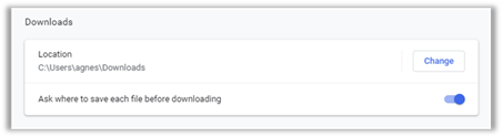
The following directions for Export, assume that this type of switch in your browser is “on”, so that the browser will prompt you for a file name and folder for the file. The way that the browser prompts for this, is dependent upon the browser.
If a switch like this is not on, the file will be created as “projects.gridd” and will show up in the browser’s download folder. The location of the download folder is set in the browser’s settings or options. The file can be moved from the download folder to another folder and renamed as desired.
Backup and Restore Projects
To create a backup file containing all your projects:
1) Select the Export option from the project menu. The Export Project(s) to File dialog will be displayed.

Figure 49 : Export Dialog
2) Click the Select All button below the list of projects. This will select all the projects in the list.
3) Click the Export button. The browser’s dialog for downloading files will be displayed. The default name for an exported file is “projects.gridd”. You may change the name to anything you would like, but it is a good idea to keep the “.gridd” extension name to make it easier to find your projects for import later.
4) Navigate to a folder, or create a folder on your machine where you would like to save the file. It’s a good idea to make a note of where you have saved the file.
5) Click the Save or OK button on your browser’s download dialog. The file will be written to your local file system in the folder selected.
To restore your projects from a backup file:
1) Select the Import option from the project menu. The Import Project(s) from File dialog will be displayed.
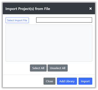
Figure 50 : Import Dialog
2) Click the Select Import File button on the top left of the dialog. This will bring up a browser dialog so that you can locate the file you want to import. Select your backup file that you created with the Export option. The file should end with a “.gridd” if it was created by the Grid Designer.
3) Click the Open button on your browser’s dialog. The file will be opened and the projects contained in it will appear in the list in the import dialog.
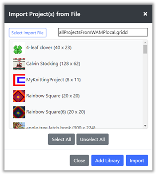
Figure 51 : Import File Loaded
4) Click the Select All button below the list of projects. This will select all the projects in the list (all the projects in the file).
5) Click the Import button. The import button will load the projects from the file into main browser storage.
a. If a project in the file is the same as in your current browser storage, no change will be made for that project.
b. If any projects in the file are different from a project of the same name in your browser storage, a warning dialog will appear saying the project will be replaced with the project from the import file. You can cancel at this point, if desired.
c. Projects in the file that are not in main browser storage will be created.
6) A Results dialog will appear with the results of the import. This will list all the projects loaded. Close the results dialog when you have reviewed the results.
Create and Use Project Libraries
It is possible to create files on your local computer to hold groups of projects for later use. I use this facility to save grid designs that I used for previous projects. This clears up space in your browser storage and provides a way to save related projects together. For instance, my Christmas stocking designs are in a stockings.gridd file that I can open later as a library.
Once a file is opened as a library, the projects contained in it will appear in the list of projects that can be opened. You may open and edit or copy from the library project. However, if the project is saved, it will be saved in main browser storage. It will not be saved back to the library file.
If you want to add the edited project back to the library file, you must export it again. Directions for how to do this are below. See the section on replacing a library project.
To create a library file containing selected projects:
1) Select the Export option from the project menu. The Export Project(s) to File dialog will be displayed.
2) Select the projects you want to export to the library file from the list.
3) Click the Export button and the browser’s dialog for downloading files will be displayed. The default name for an exported file is “projects.gridd”. You may change the name to anything you would like, but it is a good idea to keep the “.gridd” extension name to make it easier to find your projects for import later.
4) Navigate to a folder, or create a folder on your machine where you would like to save the file. It’s a good idea to make a note of where you have saved the file.
5) Click the Save or OK button on your browser’s download dialog. The file will be written to your local file system in the folder selected.
To load projects saved in a library file:
1) Select the Import option from the project menu. The Import Project(s) from File dialog will be displayed.
2) Click the Select Import File button on the top left of the dialog. This will bring up a browser dialog so that you can locate and select the file you want to import. The file should end with a “.gridd” if it was created by the Grid Designer.
3) Click the Open button on your browser’s dialog. The file will be opened and the projects contained in it will appear in the list in the import dialog.
4) Select the files you want to load as a library, or click the Select All button to select them all.
5) Click the Add Library button. The selected projects will be loaded into a library of the same name as your import file.
6) To open a library project, select the Project à open option, as usual. The list of projects will now include the library files added to the end under the library name.
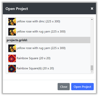
Figure 52 : Open Project with Library
7) Click the library project you want to open and click the Open button.
8) If the library project has the same name as a project in main browser storage, a warning message will appear indicating that you should use Save As to save the project under another name, unless you intend to replace the project in main browser storage.
To add projects to a library file:
1) Load the library file that is to be modified using steps above.
2) Select the Export option from the project menu. The Export Project(s) from File dialog will be displayed. The library files will be at the bottom of the list of projects.
3) Click the Select button on the list item with the library’s name. This will select all the projects in the library file.
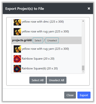
Figure 53 : Export Dialog with library
4) Select the project or projects you want to add to your library file from the projects above, or from other libraries you have loaded.
5) Click the Export button. The browser’s download dialog will be shown.
6) Select the library file on your local machine that you want to update with the new projects and click the save button.
7) The browser will ask if you want to overwrite the file, answer yes to replace the file with the new contents.
8) All of the selected projects, those in the original library and the additional ones will be written to the file.
To replace projects in a library file:
1) Load the library file that is to be modified using steps above.
2) Select the Export option from the project menu. The Export Project(s) from File dialog will be displayed. The library files will be at the bottom of the list of projects.
3) Click the Select button on the list item with the library’s name. This will select all the projects in the library file.
4) Click the project or projects in the library section that you want to replace to de-select them.
5) Select the project or projects you want to replace the projects you have de-selected from the library from the list above the library.
6) Click the Export button. The browser’s download dialog will be shown.
7) Select the library file on your local machine that you want to update with the new projects and click the save button.
8) The browser will ask if you want to overwrite the file, answer yes to replace the file with the new contents.
9) All of the selected projects, those in the original library that were selected and the additional ones will be written to the file.
Editing
Editing the grid is handled with the drawing tools. These tools use the current settings of the foreground and background colors set in the toolbar.
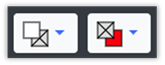
Figure 54 : Foreground and Background colors
Foreground is set by the button on the left, background is set by the button on the right.
Foreground is used to draw; background is used to fill and erase.
When you create a project, or select a new palette, the background color is used to fill the grid in preparation for drawing on top of it with the foreground color.
When the default project is created the first time you use the Grid Designer, or when the refresh button is clicked, you are presented with a grid of 20 x 20 cells, colored red, the initial background color.
The foreground color is initially set to white.
Mode Buttons
On the bottom toolbar, you will find two kinds of buttons. Some have a white background and some have a pale golden background. Those with the pale golden background are called Mode Buttons.
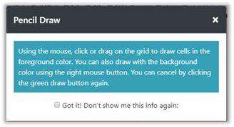
Mode Buttons are used to initiate an action on the grid. After clicking these buttons, they turn a bright green to show they are active. They remain active until the user clicks on them again, or a specific action is taken with the mouse on the grid. So that the user will understand what action they are to take on the grid, an informational popup is displayed the first time the user clicks that button.
For instance, if the user clicks the pencil button, the following informational dialog is displayed with a hint:
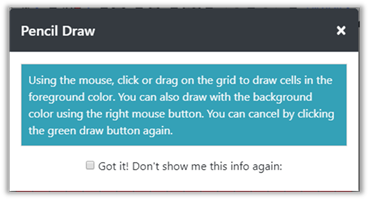
Figure 55 : Hint Dialog
If you do not want to see the dialog again, click the “Got it!” checkbox before closing the dialog.
If you would like to see the hint dialogs again, perhaps if you have forgotten how to do something, select the Enable Hints option from the Help menu.
When no mode button is active , the Grid Designer will show an open hand icon when the mouse is over the grid. This hand icon indicates that you can grab the grid and move it anywhere in the screen area.
Drawing Tools
All of the drawing tools are Mode Buttons and work in a similar way:
1) Select the button you want to use. Different fill buttons can be selected by clicking the arrow button next to the fill bucket.
2) Either a dialog or a hint popup will come up to tell you what to do next.
3) Some buttons have a single action to perform on the grid and then de-activate afterwards. Some buttons stay active until you click them again.
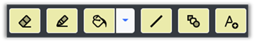
Figure 56 : Drawing Tools
From left to right, the figure above shows the following tools: Eraser, Pencil, Fill options, Line, Shape, and Text. These tools will be discussed in this section.
Pencil and Eraser
The pencil and eraser are used for free-hand drawing. They do the following:
· Pencil :
o Click or drag the mouse on the grid when the pencil is active (green).
§ When active the left mouse button will draw with the foreground color.
§ When active the right mouse button will draw with the background color.
·
Eraser:
o Click or drag the mouse on the grid when the eraser is active (green).
§ When active, both mouse buttons will draw with the background color.
The width of the pencil and eraser may be set with the line size value.
To use the Pencil or Eraser:
1) Select the pencil or eraser button.
2) A hint dialog may be displayed with directions. Read and click the “Got it!” checkbox if you do not want to see the information again. Dismiss the dialog.
3) Click a cell on the grid or drag the mouse across cells on the grid to paint with the associated color.
4) When done, select the active pencil or eraser button again to de-activate.
Example
Example
With the default project loaded (either after going to the Grid Designer initially or by clicking the browser’s refresh button), click the Pencil button on the bottom toolbar.
The informational popup comes up.
Click the “Got it!” checkbox if you don’t want to see this hint again, and close the popup.
The Pencil button will become green to show it is active. Depending upon your browser you will either see a pencil icon when the mouse is moved over the grid or a pointer finger icon.
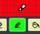
Click the mouse in one cell on the grid with the left mouse button and it will paint that cell white. Press the left mouse button down and drag and it will paint white in whatever cells you drag over, until you release the mouse button.
Click the right mouse button over a white cell and it will paint the cell red. Press the right mouse button down and drag it across some white cells; it will paint red in whatever cells you drag it over, until you release the mouse button.
This functionality with the left and right mouse buttons allows you to:
- Draw and erase without switching back and forth between the pencil and eraser tools.
- Draw with 2 colors quickly, when you set the background color to something other than your main background
Now, set the background color to blue, by clicking the background color button in the top toolbar and selecting blue from the dropdown.
The background color will show as blue. Note that changing the background color to another color for a short time is fine. It will not automatically fill the red color that was the original background color.
Draw white with the left mouse button and blue with the right mouse button.
I call it the “two-fingered fast draw”, LOL!
With the background color still set to blue, click the eraser button, to the left of the pencil. Another hint dialog will popup, click the “Got it!” button if you want and close that dialog. The eraser button will now be active and green.
Draw with the eraser tool on the grid. Notice that it is painting blue now. It paints the background color selection. If you are on a tablet or phone, using the eraser tool is a quick way to paint with a second color, since you cannot do the “two-fingered fast draw” without two mouse buttons. You will have to switch from eraser to pencil, though.
Set the background color back to red and draw again with the eraser, the eraser is now erasing and painting red in the grid.
Fill Tools
To the right of the pencil is a fill tools button. Click the fill bucket to invoke the default fill tool or click the arrow to the right of the fill bucket and a list of tools will popup. Select the tool you want from the list. The last selected tool will replace the fill bucket and you can easily reselect it later.
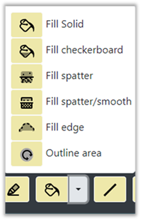
Figure 57 : Fill Tools
More specifically:
· Fill Solid
o Fills a contiguous area with a color
§ Left mouse button fills with foreground color
§ Right mouse button fills with background color
· Fill Checkerboard
o Fills a continuous area with a checkboard
§ Both left and right mouse buttons create a checkerboard with the foreground color.
§ The line size on the bottom toolbar is used to determine the size of the checks.
· Fill Spatter
o Fills a contiguous area with a color and will also fill single cells that are surrounded by that color
§ Left mouse button fills with foreground color
§ Right mouse button fills with background color
· Fill Spatter/Smooth
o Fills a contiguous area with a color, fills single cells that are surrounded by that color and also smooths the edges of the fill area
§ Left mouse button fills with foreground color
§ Right mouse button fills with background color
· Fill Edge
o Fills cells between a foreground color area and a background color area with the fill color.
§ Left mouse button fills with foreground color
§ Right mouse button fills with background color
· Outline Area
o Outlines the inside or outside of a selected area. This is described in more detail in the following section Outline Area Tool .
o The line size on the bottom toolbar is used to determine the thickness of the outline.
To use the fill tools:
1) Select the fill tool you want. That tool will replace the fill bucket on the main toolbar and will become green, showing it is active.
2) A hint dialog may be displayed with directions. Read and click the “Got it!” checkbox if you do not want to see the information again. Dismiss the dialog.
3) Click on an area on the grid that you would like to fill or outline.
4) When done, click the active fill tool button to de-activate the tool. The last selected tool will now appear in the main toolbar where you can select it without opening the popup.
Example
Example
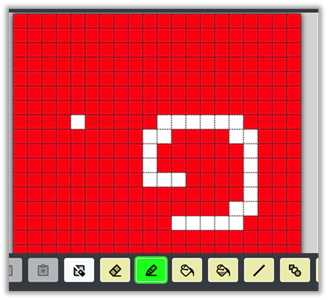
Let’s take a look at how the fill tools work. Here is my picture after playing with the pencil and eraser tools in the previous section:
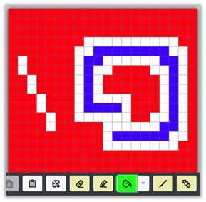
When I select the Fill Solid button, the usual hint dialog appears. After it is dismissed my Fill Solid button is active. Let’s try the fill tool to see how it works. I set the foreground color to green and click on various areas:
With the left mouse button, I click on the center of the blue and white swirl and it turns green. I click on the blue and it fills with green. Next, I click on the second white bar on the left and it turns green. Notice that the other white areas that are connected diagonally to the white bar are not affected. The fill tool works only on cells areas of the same color that are connected directly, either side to side or top to bottom.
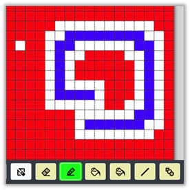
If I click the center again with the right mouse button, it fills with red. Again, sort of a two-fingered fast fill is possible here, as it was with the pencil tool. You can temporarily set the background color to use both left and right mouse buttons to fill with two colors other than the original background.
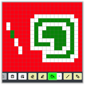
Now, I click on the arrow next to the fill bucket and select the Fill Checkerboard tool (hint dialog comes up, dismiss) and it becomes active. If I click again in the center of the swirl, I get:
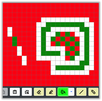
A checkerboard fill with the foreground color. In this case, the checkerboard in green is interspersed with the background color red, if the swirl area had been filled with blue, the checkerboard would be green and blue. It uses whatever color exists, as the other color, not the background color.
You can control exactly what cells are colored with the foreground color. The cell that you click on with the Fill Checkerboard tool will always be the foreground color and the pattern will start from that cell. In this way you can create alternate checkerboards like below:
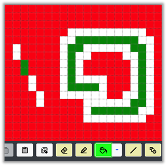
Note that the checkerboard pattern alternates from square to square.
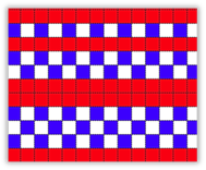
Filling in lines creates dashed stripes:
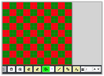
The size of the checks can be controlled with the line size value (on the bottom toolbar to the right). For instance, in the picture below, the line size is set to 2 and then the entire 20x20 grid is filled with the checkerboard tool.
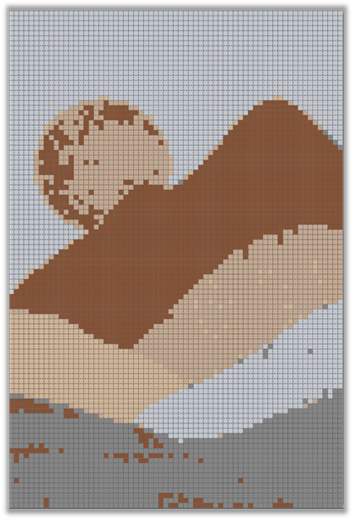
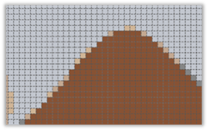
Fill Spatter, Fill Spatter/Smooth and Fill Edge are intended for cleanup after digitizing a photo. Let’s use this digitized hill image to show what these tools do:
Fill Spatter: The Fill Spatter tool targets single cells of a different color located in the fill area. Let’s look at it’s use on this area of the example image:
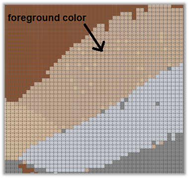
Set the foreground color to the area indicated in the image above. Then, with the Fill Spatter tool selected, click with the left mouse button on the area. This will result in the following:
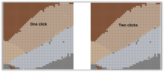
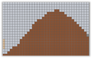
Clicking again can result in more spatter removal. Now, let’s use the Fill Spatter/Smooth tool on the same area:
Notice that the Fill Spatter/Smooth has a very similar effect on the internal spatter, but also smooths the edges of the fill area.
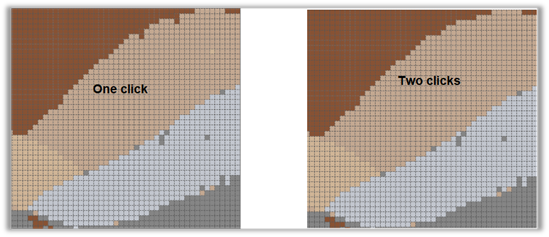
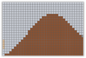
Now, let’s look at the Fill Edge tool. This tool is intended to remove colors around the edges of a colored area. Let’s look at the top edge of our hills example:
The area between the brown and the gray background has an edge of other colored cells we’d like to remove. These are often created by digitizing an image, because of anti-aliasing in the original image or photo around the edges of color changes. The Fill Edge tool will remove these colored cells. We can fill them either with the gray background or with the brown.
Before we can use the tool, we need to set the foreground and background colors to the brown and gray . This is easiest to do with the dropper tool on the top toolbar to select each color and set it as foreground and background. The Fill Edge tool will then work on cells that are between the brown and the gray, i.e. between areas of the foreground and background colors.
With the brown set as foreground and the gray set as background, we select the Fill Edge tool and left click on the brown area, the edge cells will be filled with brown.
OR, with the brown set as foreground and the gray set as background, we select the Fill Edge tool and RIGHT click on the gray area, the edge cells will be filled with gray instead. You can get the same effect by switching the foreground and background colors and left-clicking on the gray area.
Outline Area Tool
The outline area tool can be selected from the popup next to the fill bucket, see section Fill Tools :

Figure 58 : Outline Area tool
This tool draws an outline around the border of a selected area:
· Left mouse button draws with foreground color
· Right mouse button draws with background color
The line size setting determines the thickness of the outline.
To use the Outline Area tool:
1) Select the Outline Area tool button from the fill bucket popup. The button will turn green when it is active.
2) A hint dialog may be displayed with directions. Read and click the “Got it!” checkbox if you do not want to see the information again. Dismiss the dialog.
3) Click on an area on the grid that you would like to outline. The area is outlined with either the foreground or background color, depending on the mouse button used. The outline thickness can be controlled by setting the line size or by clicking again to add another layer.
4) When done, click the active (green) outline area tool button to de-activate the tool.
Here are some before and after examples of the outline tool:
| Before Outline | After Outline |
|
|
|
|
|
|
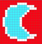
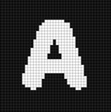

Note that the examples above are created by clicking within the given shape and letter. An outline can also be drawn around the outside of an object by clicking in the area outside.
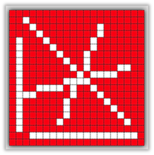
Line Tool
The Line Tool is to the right of the fill tools. It allows you to draw lines on the grid.

Figure 59 : Line Tool
·
Line Tool
o Draws a line of grid cells from the starting cell to where you release the mouse.
§ Left mouse button draws the line in foreground color
§ Right mouse button draws the line in background color
The thickness of the line tool can be controlled with the line size setting.
To use the Line Tool:
1) Click the Line Tool on the bottom toolbar.
2) A hint dialog may be displayed with directions for drawing the line on the grid. Read and click the “Got it!” checkbox if desired and dismiss.
3) Place the mouse over the grid cell where you would like the line to start.
4) Press the left or right mouse button to choose foreground or background color and drag the line to where you would like the line to end on your grid.
5) Let the mouse up.
6) When you are done drawing lines, click the Line Tool again to de-activate it.
Example
Starting from the default project (which is loaded by default when you open the Grid Designer and when you press the browser’s refresh button), let’s work with the line tool.
Clicking the Line Tool in the bottom toolbar, a hint dialog will be displayed. Read and dismiss. The line tool will now be active (green).
With the mouse over the grid, press the left mouse button and hold it down while you drag across the grid. A line will draw between the cell where you first pressed the mouse button and where you are dragging the mouse. Let the mouse button up and a line will be drawn on the grid.
Here are my lines, it’s a simple as that. If we then set the background color to blue, notice that we can now do the “two-fingered fast draw”, drawing white lines with the left mouse button and blue lines with the right mouse button.
Shape Tool
The Shape Tool is to the right of the Line Tool on the bottom toolbar:

Figure 60 : Shape Tool
The Shape Tool can be used to draw a variety of shapes. Simple shapes such as rectangles, diamonds, circles, triangles, hexagons, etc. are supported, as well as more complex shapes: hearts, water drop, egg, various flowers, star, etc.
When we click the Shape Tool, the Select Shape dialog displayed:
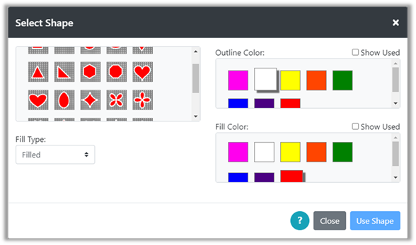
Figure 61 : Select Shape Dialog
On the left of the dialog there is a dropdown box where we can select one of three options:
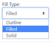
Figure 62 : Shape Fill Type
These Fill Type options are:
· Outline – only the outline of the shape will be drawn. The thickness of the outline can be controlled by setting the line size .
o User will select the outline color only
· Filled – the shape will have both an outline and a fill. Again the thickness of the outline can be controlled by setting the line size .
o User will select both an outline and fill color
· Solid – the shape will be a solid color
o User will select the outline color only and that will be used to both outline and fill
When the Fill Type is selected, the dialog will update to allow the user to select colors for outline and fill as needed.
To draw a shape on the grid:
1) Click on the Shape Tool, the Select Shape dialog is displayed.
2) Select the Fill Type desired from the Fill Type dropdown.
3) Select the shape to be drawn from the shapes shown above the Fill Type dropdown.
4) Select outline and fill colors as desired. Shape thumbnails will be updated to show the colors selected.
5) Click the Use Shape button.
6) A hint dialog may display with directions for how to draw the shape on the grid. Click the “Got it!” checkbox if desired and dismiss dialog.
7) Drag across the grid to draw the shape. Pause for a second as you drag, and you should see the shape appear. You do not have to get its placement correct in this step as you will have a chance to move the shape in the next step. You do need to get it the correct size for what you want.
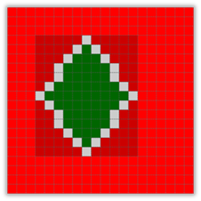
Figure 63 : Shape appears flat on grid while dragging
8) When you have the shape you want, let up the mouse button. The shape will appear as a floating paste item and the bottom toolbar will show the paste tools.
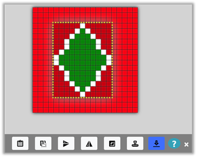
Figure 64 : After shape is dragged, can be moved
9) Grab the shape with the mouse and move it to the position where you would like to place it.
10)
Click the Apply to Grid button  to transfer the shape to the grid once and exit,
or the Stamp button to stamp the shape on the grid in multiple places.
When done, click the close X on the right side of the toolbar.
to transfer the shape to the grid once and exit,
or the Stamp button to stamp the shape on the grid in multiple places.
When done, click the close X on the right side of the toolbar.
11) The bottom toolbar will change back to the primary tool bar.
NOTE: While the shape is in the form of a floating paste item, you may use the same tools that are available when pasting an item that has been cut or copied. These tools are described in the Paste Tools section . The pasted item has also been stored in the clipboard and can be pasted again at a later time or even into another project by selecting the Paste button from the main bottom toolbar.
Text Tool
The Text Tool is located on the bottom toolbar to the right of the Shape Tool.

The Text Tool digitizes fonts so that they can be drawn on your grid. In general, most fonts require an area with at least 10 to 20 cells high for them to look presentable. If you are looking for text that is smaller, the library contains simple block letters from 5 to 10 cells in height. See the library section for more information on using these block letters.
The section will describe the use of the main text tools for use creating text that is generally larger than 10 cells in height. Some fonts and characters are useful down to a height of 7, so the tool allows you to select a font size starting at 7.
To use the Text Tool:
1) Click the Text Tool.
2) A hint dialog may be displayed explaining how to create a text area on your grid. Click the “Got it!” checkbox if you do not want to see the hint again, then dismiss the dialog.
3) Create a text area by dragging the mouse on the grid to create a rectangular area roughly where you would like your text to appear. You will be able to move and resize the text before applying it to the grid. All you need is a general area to start.
4) When you let go of the mouse, text will be drawn in your text area. If it’s the first time you have used the text tool, the text ABC will be drawn.
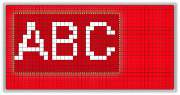
Figure 65 : Text in Text Tool
5) The bottom toolbar will change to show the text tools.
Figure 66 : Text Toolbar
6) Enter the text you would like on the left, in place of ABC.
7) Select the font you would like from the dropdown. When you first use the text tool this will be set to Roboto. Select the font you want.
8) Some fonts have a Bold and an Italic version. Click the B or I button to make the text bold or italic.
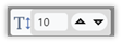
9) You can change the size of the text up or down or type in the font size explicitly using this widget:
Figure 67 : Text font size
10) The text may also be rotated at 90 degree increments with the rotate button.
Figure 68 : Text rotate butto n
11)
You may toggle the background color on and off with the toggle background button:
 .
Both background and foreground colors can be changed on the top toolbar or on the floating palette.
.
Both background and foreground colors can be changed on the top toolbar or on the floating palette.
12) You may also drag the text area around to place it exactly where you want it.
13)
When you have the text correctly created and placed, click the Apply Text to Grid  button.
14) If you want to cancel, click the close X on the right side of the toolbar to cancel.
Line Size
Line Size can be set for the drawing tools. The Line Size widget is located on the far right of the bottom toolbar. It can be set from 1 to 10 cells in width.
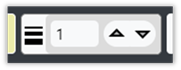
Figure 69 : Line Size Widget
Line Size affects the following drawing tools:
· Pencil and Eraser – affects the drawing/erasing width and height. If the line size is 3, then clicking the pencil or eraser on the grid will draw/erase a 3 x 3 area of the grid.
· Line Tool – affects the width of the line. If the line is vertical or horizontal, its width will be the same as the line size in cells.
· Shape Tool – affects the outline width of a shape in the same way as for a line.
· Outline Tool – sets the thickness of the outline.
· Checkerboard fill – sets the size of the checks in the checkerboard.
Add/Delete Rows or Columns Tool
The Add/Delete Rows or Columns Tool is located on the far left of the bottom toolbar.
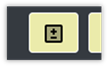
Figure 70 : Add/Delete Rows and Columns
This tool allows you to add or delete rows and columns anywhere in the grid. It is a mode button, like the drawing tools and will be green when it is active, while the user is selecting rows and columns on the grid.
To use the Add/Delete Rows or Columns tool:
1) Click the Add/Delete Rows or Columns tool. The Add/Delete Rows and Columns dialog will be displayed.
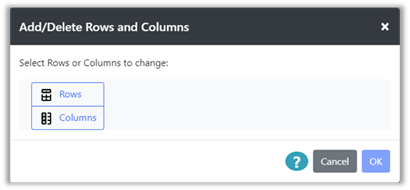
Figure 71 : Add/Delete Rows and Columns Dialog
2) Select either Rows or Columns to change. The dialog will be updated.
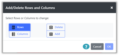
Figure 72 : Select Add/Delete for Rows or Columns
3) Select either to Add or Delete the Rows or Columns you have selected.
a. If Delete is selected, the OK button will become selectable. Click OK.
b. If Add is selected, the dialog will be updated.
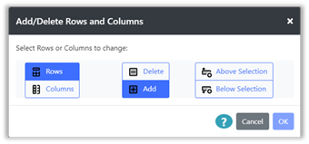
Figure 73 : Select where to Add Rows
c. If the user has selected Rows, they will be asked if they are to be added Above or Below the row selection that is to be made.
If the user has selected Columns, they will be asked if they are to be added to the Left or Right of the column selection that is to be made.
d. Select an option and the OK button will be enabled.
e. Click OK. The dialog will be closed.
4) A hint dialog may be displayed with directions, as for all mode buttons. Read and click the “Got it!” checkbox if desired and close the dialog.
5) Drag the mouse on the grid to select rows or columns. They will either be deleted, or inserted according to your selections.
Selection
Rectangular areas of the grid can be selected with the Selection Tool. The selection can then be cut, copied, cleared or used for color substitution.
Selection Tool
The selection tool button along with the button to cancel the selection are located on the left side of the bottom toolbar.
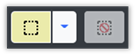
Figure 74 : Select and Cancel Select
When you click the down arrow next to the selection button, a pop-up will show the different selection tools:
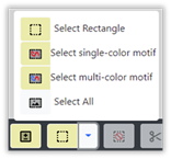
Figure 75 : Selection Tools
Selection of a tool in the pop-up will replace the default tool button next to the down arrow.
To select a rectangular area of the grid:
1) Click the Select Rectangle button.
2) A hint dialog may be displayed. Read and click the “Got it!” checkbox if desired, then dismiss the dialog.
3) If you have selected the Rectangular Select option, drag a rectangular area across the grid with the mouse.
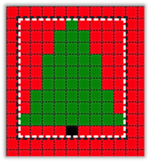
Figure 76 : Selection Box
4) The selection box can be moved and resized.
a. Each edge can be moved by grabbing the edge and dragging.
b. The entire box can be moved by placing the mouse in the center and dragging it where you want it.
To select the entire grid:
1) Click the Select All option. This will create a rectangular selection around the entire grid.
2) The edges of the selection area can be moved and resized in the same manner as for any rectangular selection (see section above).
To select a single-color motif:
1) Click the Select single-color motif option.
2) A hint dialog may be displayed. Read and click the “Got it!” checkbox if desired, then dismiss the dialog.
3) Click on a non-background-colored cell on the grid. That cell and any of the same color that are connected to it, including diagonal connections, will be selected.
|
|
|
|
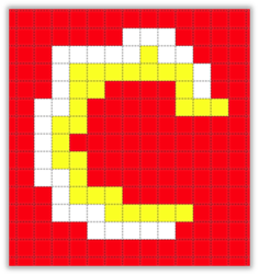
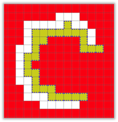

Figure 77 : Motif Selection, yellow Selected(center), white selected(right)
To select a multi-color motif:
1) Click the Select multi-color motif option.
2) A hint dialog may be displayed. Read and click the “Got it!” checkbox if desired, then dismiss the dialog.
3) Click on a non-background-colored cell on the grid. That cell and any non-background cells connected to it, including diagonal connections, will be selected.
|
|
|

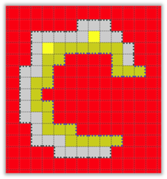
Figure 78 : Multi-color motif selection, both yellow and white selected (right)
See the next sections of this document for what you can do with the selection.
The selection can be cleared with the Cancel Select button on the bottom toolbar, or by clicking once anywhere on the grid.
Selection Operations
Cut
Once a selection is made, as described in the Selection Tool section above, you can cut the contents of the selection. Cut will clear/erase the area where the selection was, AND put a copy of the selection into the Grid Designer’s clipboard. You can then paste that selection, either to move it to a new location in your current grid or to copy it to another project grid entirely, by opening another project while the selection is saved in the clipboard.
Use cut when you want to move the selection somewhere else.
To cut the selection, click the Cut button, on the bottom toolbar (scissors icon).

Figure 79 : Cut button
The selection will be cleared, and the contents of the selection will be in the clipboard (in memory), ready for a paste action. See Paste section below.
Copy
Once a selection is made, as described in the Selection Tool section above, you can copy the contents of the selection. Copy will leave the original selection area alone and make a copy of its contents in the Grid Designer’s clipboard. You can then paste that selection elsewhere to copy it. It can be copied to another place in the current grid, or to another project’s grid.
Use copy when you want to make a copy of the selected area to place somewhere else.
To copy the selection. Click the Copy button, on the bottom toolbar.

Figure 80 : Copy button
The selection box area will be unchanged, and the contents of the selection will be in the clipboard (in memory), ready for a paste action. See Paste section below.
Substitute colors in selection
Once a selection is made, as described in the Selection Tool section above, you can use the selection area to restrict color substitution. Color substitution is done with the Substitute Colors button located on the top toolbar.
More information on color substitution can be found in the Substitute Colors section .
Clear and Crop Options
Once a selection is made, as described in the Selection Tool section above, you can clear/erase or crop based on the selection by using one of three options available:
· Clear the selection (fills selection with background color)
· Clear outside the selection, leave the selected area unchanged (fills background color in the entire grid OUTSIDE of the selection)
· Crop the grid to include only the selected area (changes the size of the grid to include only the selected area).
All three of these options are placed together next to the Clear All button. Click the down arrow button next to the Clear All button to see all three options. The last selected option will replace the Clear All button on the bottom toolbar and will be selectable from there until another option is selected.
Figure 81 : Clear All button
If no selection is made, the Clear All button will clear the entire project, including project name. Do this only if you want to start over completely with your drawing.
Paste
Once an item has been placed in the Grid Designer’s clipboard (in memory) with the Cut or Copy options, it can be pasted onto the grid, moved, modified with the paste tools and eventually stamped or applied to the grid.
Items can be added to the clipboard in multiple ways:
· Cut a selection, described in the Cut section .
· Copy a selection, described in the Copy section .
· Created with the Shape Tool, described in the Shape Tool section .
· Created with the library tool, described in the Library section .
Once an item is in the clipboard, it can be pasted to the open project, to another project or to a new project. To paste to another project, create the item with one of the methods above, then open another project with the Project à Open option and paste, as below. To paste to a new project, create the item with one of the methods above, then select Project à New Project, complete the resulting New Project Layout dialog and click Create Project. Then paste the item into the new project, as below.
NOTE: To paste an object from one project to another, both projects must use the same palette.
An item is pasted with the paste button.
This button pastes the item with the background filled if the item is coming from your own cut/copy action and a rectangular select. The background can be turned off once the paste tools are displayed.
If the item was created with one of the motif selection options, the background will be turned off initially. You can turn the background on, if desired, once the paste tools are displayed.
If you are re-pasting a pattern from the library or a shape from the shape tool, the background will be turned off to start. You can turn the background on, if desired, once the paste tools are displayed.
The item will be pasted on the grid as a floating paste item and the bottom toolbar will change to the paste toolbar.

Figure 82 : Floating Paste Item
The object can be grabbed with the mouse and moved, modified with the paste tools on the bottom toolbar, and either stamped or applied to the grid when ready. Each of these possible actions is described in the next section on Paste Tools.
Paste Tools
The paste tools appear on the bottom toolbar once an item has been pasted from the Grid Designer’s clipboard.
Figure 83 : Paste Tools
From left to right, in the figure above, these tools are:
· Toggle background on/off
· Make Smaller
· Make Larger
· Rotate 45 degrees
· Custom Change – rotate any angle and resize to any number of rows and columns
·
Flip vertically
·
Flip horizontally
· Invert two colors
· Fill entire grid by repeating the paste item
· Fill area by repeating the paste item
· Stamp and move the paste item onto the grid
· Apply the paste item to the grid
· Reload the original paste item
To exit the paste area at any time, click the close X on the right of the toolbar.
The following sections describe each of these tools.
Toggle Background
Clicking the Toggle Background tool button will toggle the background color fill on and off in the background space around your item. In the following figures, the extra space at the top of the item is filled with background color in one case, and is clear in the other.
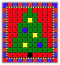
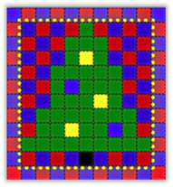
If the item you have selected fills its selection rectangle completely, with no background color, there will be no difference in the toggle state, as there will be no extra cells to fill, in the selection rectangle.
Make Larger
Click the Make Larger tool button to enlarge the paste item. The first time the button is clicked, the image will be increased 2x. The next time the button is clicked, it will enlarge to 3x the original. Successive clicks will do 4x original, 5x original, 6x original, etc.
To resize the paste item to a specific number of rows and columns, see the Custom Change section .
Make Smaller
Click the Make Smaller tool button to shrink the paste item. The first time the button is clicked, the image will be shrunk by 1/2. The next time the button is clicked, it will shrink to 1/3 original. Successive clicks will do 1/4 original, 1/5 original, 1/6 original, etc.
To resize the paste item to a specific number of rows and columns, see the Custom Change section .
Rotate
Click the Rotate button to rotate the paste item 45 degrees clockwise. The pictures below were created by clicking the rotate button successively.
|
|
|
|
|
|
|
|
|
|

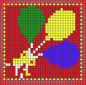
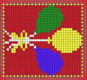
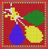
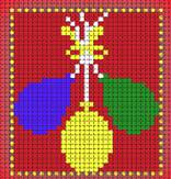

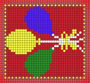
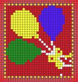
Figure 86 : Rotation Examples
To rotate the paste item to a specific angle, see the Custom Change section .
Custom Change
The Custom Change button
 allows you to rotate to a specific angle or resize the paste item to a specific height and width.
To make a custom change:
1) Click the Custom Change button. The Change Paste Item dialog will be displayed.
|
|
|
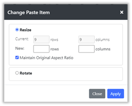
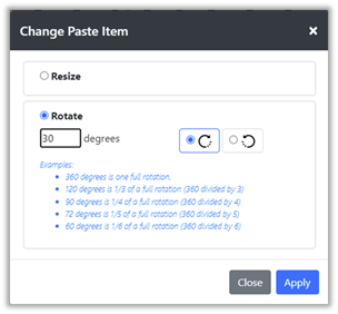
Figure 87 : Change Paste Item dialog
2) Select either the Resize or Rotate option.
a. For Resize, enter the new number of rows and columns for the paste item. Then click Apply. If the Maintain Original Aspect Ratio checked box is checked, values for rows or columns will automatically be calculated when you change either.
b. For Rotate, enter the number of degrees of rotation desired, from 1 to 360. Select either the rotate clockwise or rotate counterclockwise button on the right. Then click Apply.
Flip Vertical/Horizontal
Clicking the Flip Vertical or Flip Horizontal tool button will flip the contents of the paste buffer vertically or horizontally.
Invert Colors
If the item consists of two colors, clicking the Invert Colors will invert those colors.
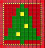

If your item contains 3 colors and includes the background color, you can create a 2-color item by toggling the background off.
If your item contains only 1 color with the background off, you can create a 2-color item by toggling the background on.
Fill Entire Grid
The Fill Entire Grid button will copy the paste item across the entire project grid. If the background is turned off when doing this, it will have the effect of overlaying any existing picture. If the background is turned on, it will completely erase any existing picture with the paste item.
Fill Area
The Fill Area button will copy the paste item across a bounded area, similar to the Fill tool on the main toolbar that fills a solid color. The area that will be filled is selected by the position of the center black and white dot on the paste item. Usually, the position of the dot will not matter, as the area to be filled will be much larger than the paste item. However, if the area to be filled is small, the dot must be positioned over the area in order for the fill to paste into that area.
Stamp
The Stamp button allows you to repetitively stamp your paste item onto the grid. The Stamp tool will automatically reposition items to repeat the same distance from the original stamp, even when you move the paste item during the stamping process.
This is best shown through an example.
Example
Example
Suppose we have the following design that we want to repeat across our pattern.
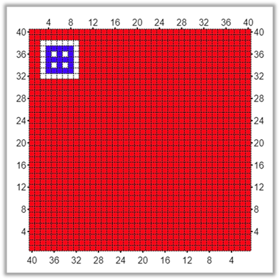
We will select the blue and white square with the selection tool, then cut and paste the selection. This will bring up the paste tools with the selection as shown.
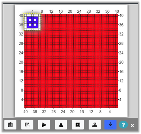
We move the pasted item to our starting position, leaving a one cell edge on the top and side.
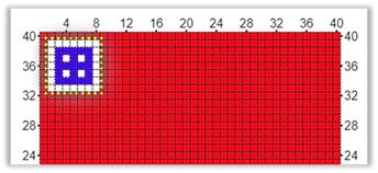
We want to paste this item across the top with a separation of 1 cell, as many times as will fit.
Now we click the Stamp button  .
.
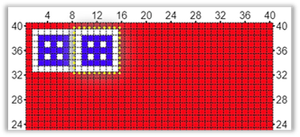
The paste item is transferred once to the grid, where we first positioned it. Then the paste item is moved to the right. We want the next stamp to have one cell between it and the first stamp, so we move the paste item to the right with the mouse.
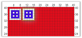
Then we click the stamp button again.
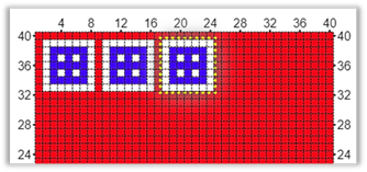
The paste item was transferred to the grid and moved to the right again. However, instead of just moving itself to the edge of the last item, it has learned from us that it needs to add one space. It remembers where we placed it and repeats that spacing. If we had left 2 empty cells between it and the first stamp, it would now place itself two empty cells from our last stamp.
We can continue stamping across the grid until we reach the edge. When there is no more room to place another stamp, the stamp tool will try to move down the edge.
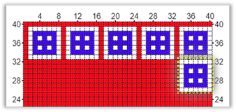
The stamps have gone right against the right edge, we can add a column to the right side later, but for now we will continue moving down the right side. We move the paste item down one row so there is one row of red cells between it and the last stamp.
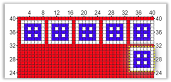
Then continue stamping down the right side till we reach the bottom.

When the stamp reaches the bottom right corner it tries to move to the left. We move it over one cell and continue stamping across the bottom. When it reaches the left side, it will try to move up the left side. We correct it by putting it one cell above our last stamp in the corner.
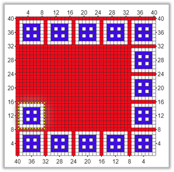
Now we can continue stamping up the left side. We can add a row at the bottom when we are done.
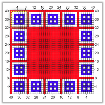
The paste item is now positioned over our first stamp. We click the close X on the right side of the toolbar and we are back in the main editor. We use Design à Grid Size to add a row and column to the bottom and right side and we have a completed border.
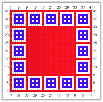
One additional note, the stamp tool can repeat its position change even when moving diagonally.
For example, after the first stamp, just position the paste item where you want it, then continue to click stamp and it will repeat whatever offset it had to the original stamp each time.
Here we set the offset by moving the paste item after the first stamp.
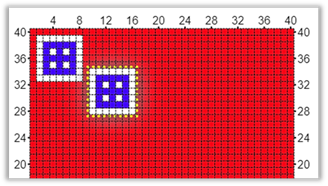
Then continue to stamp. The same spacing will be repeated.
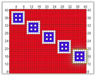
The keyboard shortcut for the stamp tool is the space bar. More information on keyboard shortcuts is available in section Keyboard Shortcuts .
Reload Paste Item
The Reload button  reloads the original paste item.
This may be needed after applying unwanted rotations or resizing to the paste item.
reloads the original paste item.
This may be needed after applying unwanted rotations or resizing to the paste item.
Apply
The Apply button  applies the paste item to the grid once and then returns to the main editor.
Clear All
The Clear All button is located near the center of the bottom toolbar. It functions in two different ways depending upon whether or not a selection box exists. Clear All is part of three options that can operate on a selected area. See more about this under Clear and Crop Options .
If a selection box exists, i.e. you have used the selection tool to select a rectangular area, then clicking the Clear All button will clear that area, painting it the current background color.
If no selection box exists, then Clear All clears the project data and undo/redo. This action is not undoable. If your project is not saved a warning dialog appears. Do this only if you want to completely redo your drawing from the beginning.
If you want to clear the entire grid and keep your existing undo operations intact, select the entire grid with the selection tool and then select the Clear All button.
Loading a pattern from the library
The library contains a collection of small patterns that you may use in whatever way you wish, on whatever project you desire, regardless of whether or not the project is commercial or for your own personal use.
Some patterns were created by myself, others were contributed to the library by other designers. If you would like to make a contribution to the library, contact me through my contact page on freese-works.com (click contact tab at the top). Save your patterns as links using the Project > Share option and send the links to me. You must agree that the patterns you contribute can be used by anyone for any purpose, including commercial use. Contributed patterns should be no larger than about 60 x 60 cells.
If you make a contribution, your name will be displayed on the bottom left of the Library Patterns dialog (shown below) along with a link to your website, facebook page or other page that represents you, whenever one of your patterns is selected in the dialog.
The library button
 is located on the far right of the main bottom toolbar.
To load a pattern from the library:
1) Click the library button on the far right of the main bottom toolbar. The Library Patterns dialog will be displayed.
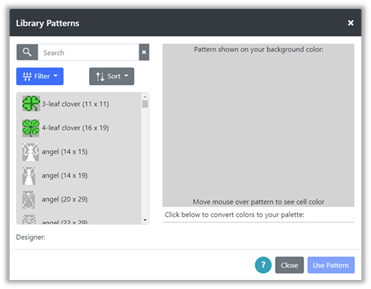
Figure 93 : Library Patterns Dialog
2) On the left is a list of patterns in the library. The name of the pattern is visible in the list. The description of the pattern is visible in a tooltip, if you place your mouse over an item. The list of patterns can be filtered, sorted and searched.
a. Selecting the Filter button above the pattern list will display a popup where you may filter the list by size and type. Select a size, if desired and any types you would like to filter for. Then click the Go button to apply the filter to the list.
|
|
|
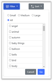
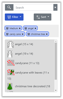
Figure 94 : Filter Library Pattern List
Filter selections are shown on tags above the list. To remove any filter simple click on the X on the right side of the tag to remove that filter.
Some useful filters to be aware of are:
· borders – patterns made to repeat vertically and horizontally when rotated,
· corner – corner patterns intended to work with some borders,
· fill repeat – pattern made to fill an entire area when repeated,
· repeat – both borders and fill repeat patterns.
b. Selecting the Sort button above the pattern list will display a popup where you may sort the list by name, description, height and width. You may sort either ascending or descending for each. You may select more than one sort option.
|
|
Figure 95 : Sort Options |
|
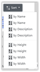

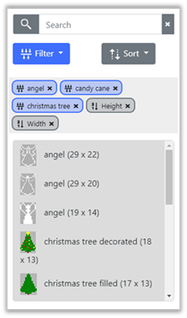
c. You may search for specific text within the name or description of the library pattern. To search for specific text, simply type the text into the Search box. To cancel the search, click the X on the right side of the search box. The search box also keeps a list of the last 5 text values you searched for. Clicking on the Search box will show a dropdown of your last 5 searches. You may select one of these also.
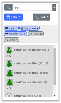
Figure 96 : Library Text Search for tree
3) When you have found a pattern, you would like to use, click on that pattern to see it on the right side of the dialog. The pattern will always be shown on top of your currently selected background color. The designer’s name and link will show on the bottom left.
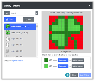
Figure 97 : Library Pattern Selected
4) Below the pattern will be a list of colors used in the pattern. If these are not found in your currently selected palette, then either a substitution must be done to select a color from your palette, or the color from the pattern must be added to your current palette. When all missing colors are substituted or added, the Use Pattern button will become selectable.
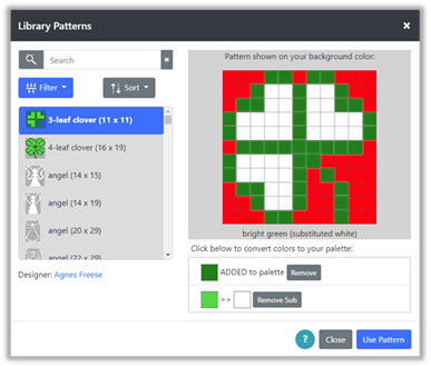
Figure 98 : Library Pattern with one color substituted and another added
5) Click Use Pattern to use the pattern. The pattern will appear as a paste item. The paste tools will be available on the bottom toolbar. Use the blue Apply button or the Stamp button to apply the pattern to the grid. See the section Paste Tools for more information.
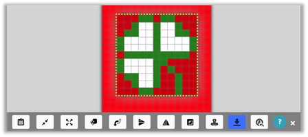
Figure 99 : Library Pattern Paste Item
When you leave the paste area, you may paste the object again using the paste button on the main bottom toolbar.
If you use your current background color as a fill color for your pattern, you have the choice of either making that color a solid color in the pattern, or making that color transparent in the pattern. For instance, if in the clover pattern, we selected the interior to be the same red as our background color, two additional buttons will appear next to that color in the list:
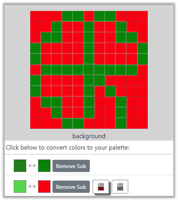
Figure 100 :Transparent Color in library pattern
Selecting this button:
 will make the red inside the clover a solid red in the pattern.
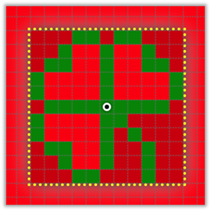
Figure 101 : Solid Background Color in library pattern
Selecting this button:
 will make the red inside the clover become transparent in the pattern.
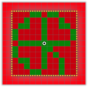
Figure 102 : Transparent Background Color in library pattern
Undo/Redo
Undo and Redo buttons are located on the top toolbar.

Figure 103 : Undo (left), Redo (right)
Clicking the Undo button on the left, will undo the last drawing that was done. It will also undo changes to the grid size. It does not undo changes to the cell size.
Clicking the Redo button will redo the last Undo that was done.
Working with Colors
Edit Palette
Any palette can be modified. The Custom palette is empty to start, you may add any colors to that palette you would like.
To modify a palette:
1) Select the Palette option from the Project dropdown menu. The Select Palette dialog is displayed.
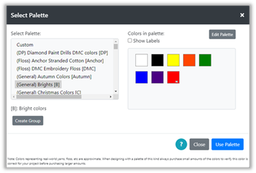
Figure 104 : Select Palette Dialog
2) Select the palette you wish to modify from the list on the left.
3) Click the Edit Palette button on the upper right of the Select Palette dialog. The dialog will be updated to the Edit Palette Dialog.
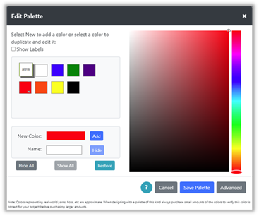
Figure 105 : Edit Palette Dialog
4) Here you can do the following:
· Add a new custom color to the palette
· Hide existing colors from view
· Remove custom colors from the palette
· Hide All existing colors or Show All
· Restore the palette to its original colors
5) To add a color, select the New button on the upper left of the color list. If you have just come into the dialog, this button will already be selected.
To the right of the color list are two color panels. The panel on the far right provides a slider where we can select the general hue of the color, we’ll call this panel the Huebar . The panel on the left is a large panel where we can change the brightness and saturation of the hue we select; we’ll call this the Brightness Panel .
6) To create a color, move the slider on the Huebar to the hue you want. Here we are selecting a blue-green hue. You can move the slider by dragging it or clicking on the color you want.
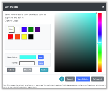
Figure 106 : Edit Palette Dialog with blue-green hue selected
7) On the large Brightness Panel there is a small circle that indicates the current selection. Initially this is placed on the upper right of the Brightness Panel.
The position of the circle selection indicates how bright and how saturated the hue will be. The figure below shows how saturation and brightness change in the Brightness Panel.
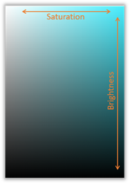
Figure 107 : Brightness Panel
When the circle is positioned on the upper right, this is the brightest and most saturated color for the selected hue. Moving the circle down the panel, reduces brightness, making the color darker. Moving the circle to the left reduces saturation, fading the color.
8) The values for hue, saturation and brightness can be seen and modified directly by clicking the Advanced button on the lower right. This will show an advanced panel below the dialog.
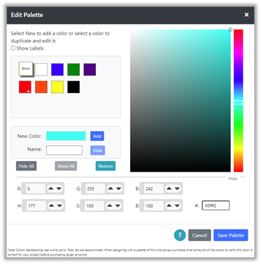
Figure 108 : Edit Palette Dialog with Advanced options
9) The advanced panel can be used to view and edit color values directly. Referring to the figure above, this panel shows:
· R, G and B values: These are Red, Green and Blue values of the current color. RGB color values are commonly used to specify colors on a computer. If you have a color that you have selected from elsewhere, such as a paint or drawing program. There is likely a way you can view the color’s RGB values in that program. You can then enter those values here, to define the same color. These values range from 0 to 255.
· H, S, B values: These values correspond directly to the Huebar and the Brightness Panel selections. H is hue, S is saturation and B is brightness. H ranges from 0 to 360 where 0 and 360 represent the same color (red). S and B range from 0 to 100.
· On the bottom right of the advanced panel is the # field. This shows the color’s RGB values in hex notation. This is also a common shortcut for specifying the RGB values. If you know a color’s hex code, you can enter it here.
10) To complete adding the new color, complete selection of the new color, either by entering values in the advanced panel or by user the Huebar and Brightness Panel. The currently selected color is shown in the rectangle next to the New Color field.
11) Once you have the color you want, enter a name for the color in the Name field.
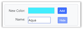
Figure 109 : Adding New Color Aqua
12) Click the Add button to the right of the New Color rectangle. The color will be added to the color list. The name in the list can be viewed either by selecting the Show Labels checkbox, or by viewing the tooltip for the color by placing the mouse over the color square in the list.
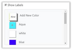
Figure 110 : Custom Color Aqua Added
13) Note that the color added is marked with a “C”, for custom, in the center of its color square. This indicates that the color was not originally part of the color palette, it was added by you.
14) Custom colors can be removed at any time by selecting the color in the color list and clicking the Remove button. You can remove ALL of the added colors by clicking the Restore button.
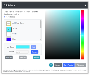
Figure 111 :Removing Custom Color
15) Note that the Remove button changes between “Remove” and “Hide” functions, depending upon which color is selected. If a custom color is selected, the button performs the Remove function, removing that color from the palette. If an original color is selected, the button performs the Hide function.
Sometimes it is convenient to hide original colors when you do not intend to use them. This is particularly useful when using a large yarn or floss palette, where you are only using a handful of colors. Hiding the others removes them from the display while you are working and makes it easier for you to find and select the colors you are using.
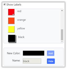
Figure 112 : Hiding Original Color
16) Clicking the Hide button when the black color is selected (shown in the figure above), will show the color with an “H” in the middle of its color square.
Figure 113 : Hidden Color with "H"
Colors that are hidden will show when viewing and editing the palette, but will not show in the foreground and background color dropdowns while editing your design.
17) If you want to show a color that is hidden, simply select the color and click the Show button.
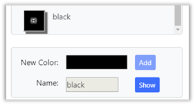
Figure 114 : Showing a hidden color
NOTE: Colors that are currently being used in the pattern being edited, cannot be hidden or removed. Colors that are currently being used are marked with a small rectangular icon as shown in the figure below:

Figure 115 : Icon showing color is used
18) For convenience when working with large palettes, there are three buttons on the bottom left of the Edit Palette dialog, Hide All and Show All and Restore.

Figure 116 : Hide All / Show All
Hide All can be used to hide all the original colors, then select only the few colors you will be using and Show them.
Show All can be used to return all of the original colors that have been hidden.
Restore can be used to reset the palette to its original state. This removes custom colors and shows all original colors that were hidden.
19) When you have finished editing your palette, click the Save Palette button at the bottom of the dialog. If you want to discard the changes you have made, click the Cancel button. In both cases, you will be returned to the Select Palette dialog, where you can either select another palette to edit, or select a palette to use.
Palette Groups
You can create groups of palettes and use the group in the same way you would use a single palette.
To create a palette group:
1) Open the Select Palette dialog with Project > Palette.
2) Click the Create Group button on the lower left of the dialog. This will open a new section in the middle of the Select Palette dialog where you can create the group.
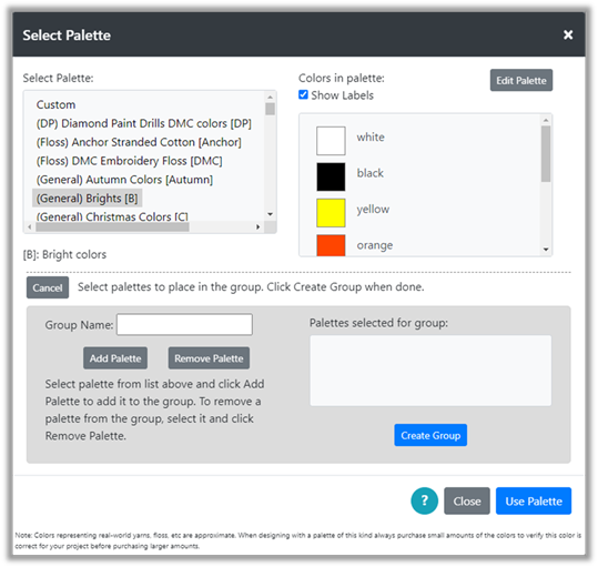
Figure 117 : Create Group
3) Type in a name for the group in the Group Name field.
4) Select palettes from the palette list above and click the button Add Palette to add them to the list of palettes selected for the group.
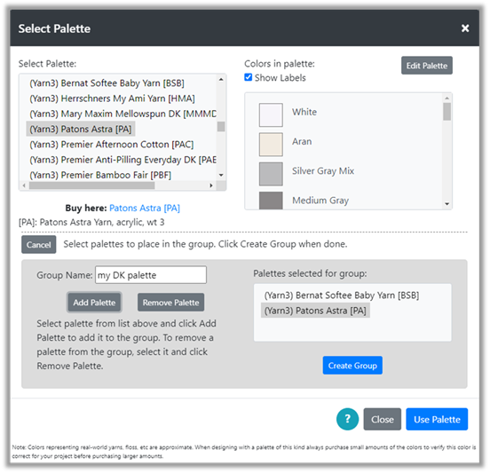
Figure 118 : Group Palette List
5) To remove a group from the list, select it and click Remove Palette.
6) When you have all the palettes you want in your group, select the Create Group button and the group will be added to the palette list, just below the Custom palette.

Figure 119 : New Group Created
7) Each palette has an abbreviation. These are shown in the palette list inside square brackets. For example, the abbreviation for the “Diamond Paint Drills DMC Color” is DP. When a group is created, the color name in the group will have the abbreviation for the palette they come from at the end of the color name. Note the [BSB] for the white from Bernat Softee Baby and the [PA] from Patons Astra yarn. This will indicate which yarn the color corresponds to.
If multiple palettes contain exactly the same color, then only one of them will show in the group.
To delete a palette , select it in the Select Palette dialog and click the Delete Group button. If you later open a project that used the group, the group will be recreated in the palette list.
If you share a project that uses a group with another person using Grid Designer, then when they open the project, the group you created will be created in their system.
You may edit groups in the same way you edit palettes. See the section Edit Palette .
Once added, the group can be selected from other areas of Grid Designer, such as Project > New Project and Project > Create From Image. It can be used like any other palette.
Substitute Colors
Substitution of colors is initiated with the Substitute Colors button located on the top toolbar. It can be limited to a selected area by first selecting an area with the selection tool .

Figure 120 : Substitute Colors Button
To substitute colors:
1) If you want to limit the area that is changed, select an area with the selection tool . You can select a rectangular area or a single color or multi-color connected motif. When you select Substitute colors, only the area selected will be modified.
2) Click the Substitute Colors button on the top toolbar. The Substitute Colors dialog is displayed.
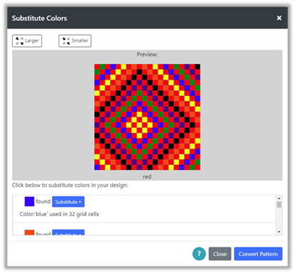
Figure 121 : Substitute Colors Dialog
3) This dialog shows a picture of your current project grid. Each color that is found in your grid is listed below the picture with a Substitute button. Moving the mouse over the preview picture will show you the name of the color in that cell. Clicking a cell on the picture will scroll the list to show that color. For instance, clicking a yellow cell will scroll the list to show the color yellow.
If you have selected an area, that area will be shown in the substitute colors dialog as a rectangular area. Even if you select a motif, a rectangular area will be shown in the dialog, but only the motif’s colors will be modified.
You can make the preview picture smaller and larger by using the buttons on the left.
4) To substitute one color for another, click the substitute button next to the color you want to replace. A small popup will appear with the colors you may select from.
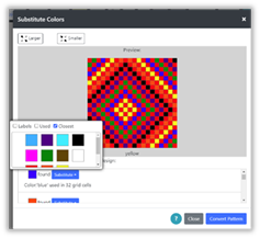
Figure 122 : Select Color to substitute
5) In the figure above we select a color to replace blue in the grid. After selection, the picture is updated with the new color. Here blue has been replaced with white. If a selected area was created before clicking the Substitute Colors button, then only those cells in the selected area will be modified.
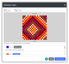
Figure 123 : Color Substituted
6) To remove the color substitution, click the Remove Sub button.
7) Make other color substitutions as needed.
8) When the picture is what you would like, click the Convert Pattern button and your main grid will be updated with the color substitutions.
9) Substitutions done from the Substitute Colors button are undoable. You can use the Undo button to undo them, once you click the Convert Pattern button.
Color Dropper
You can set the foreground and background colors to the color of a cell in the grid with the color dropper button.

To use the color dropper:
1) Click the color dropper button on the main toolbar. A hint will be displayed the first time you do this, giving you directions to click on a cell on the grid to select the color of that cell. Close the hint box or select Got it! at the bottom and close if you don’t want to see the hint again.
2) Click on a cell on the grid that you want to select the color of.
3) A dialog will pop-up asking if you want to set the foreground or background color. Select the one you want and click OK.
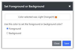
Figure 124 : Set Foreground or Background Dialog
Display Menu
The Display Menu appears on the right side of the main toolbar and allows the user to modify how the grid and mouse are displayed.

Figure 125 :Display Menu Location
When opened, the menu contains the following items:
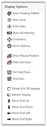
Figure 126 : Display Menu Options
Some items will be hidden when the menu opens; access all items in the menu by scrolling. Each of these options will be discussed in the following sections.
Show Floating Palette
The Show Floating Palette option on the Display menu toggles the floating palette, on and off. When the palette is turned on it initially appears in the upper left corner of the screen. It can be moved anywhere and used to select the foreground and background colors in place of selecting them from the dropdowns on the top toolbar. The floating palette contains two sections, Foreground Color and Background Color. Checkboxes at the top work the same way as these checkboxes do on the foreground and background pull-down menus on the top menu bar. The Floating Palette is easier to access then the dropdowns and can be freely moved around the screen by grabbing the gray bar at the top.

Figure 127 : Floating Palette
Show/Hide Grid Lines
The Show/Hide Grid Lines option on the Display menu toggles the dashed grid lines which are drawn at the cell level, on and off.

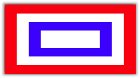
Show/Hide Mouse Position
The Show/Hide Mouse Position option on the Display menu toggles the visible position of the mouse.
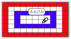
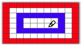
The format for the mouse position is:
(#rows from top, #rows from bottom), (#columns from left, #columns from right).
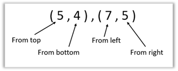
So, in the figure above, the value (5,4), (7, 5) means that the mouse is in the 5th row from the top and 4th row from the bottom. It is in the 7th column from the left and the 5th column from the right.
When the mouse position is on, the position of a pasted item is also shown as the pasted item is moved.
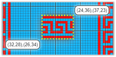
Figure 132 : Mouse Position of Paste
Show/Hide Numbering
The Show/Hide Numbering option in the Display menu turns numbering on and off.
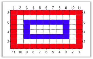
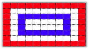
Crosshairs…
Selecting the Crosshairs option will show the Turn Crosshairs On/Off dialog, where you can select up to 6 crosshairs that can be displayed over your grid.
Figure 135 : Turn Crosshairs On/Off
These crosshairs can be used as guidelines to help you when editing your design. For instance, when I make Christmas stocking patterns, those patterns are 62 sts wide, but only the center 30 stitches appear on the front of the stocking. To define the edge of these 30 stitches, crosshairs could be put up over the pattern 16 spaces from each side so that it is clear where the edge of the front of the stocking ends (see figure below).
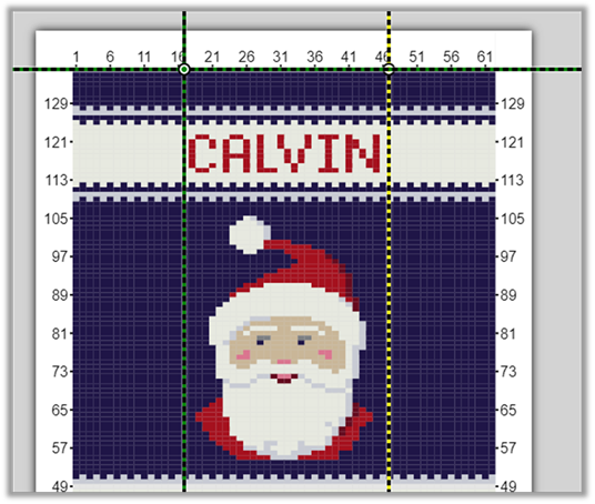
Figure 136 : Crosshair Example
Crosshairs can be used in any way you find them useful when working on your drawing.
Select the crosshairs you want to show on your grid from the Turn Crosshairs On/Off dialog, then click Save. Multiple crosshairs will initially be drawn on top of one another. Select the circle at the center of the crosshairs and drag to move the center to the position you would like. Tip: to see the position of the crosshair center as you drag, select the Display > Show Mouse Position option .
More Options…
Selecting More Options from the display menu will bring up the More Display Options dialog. This dialog contains more display options, as well as printing options.
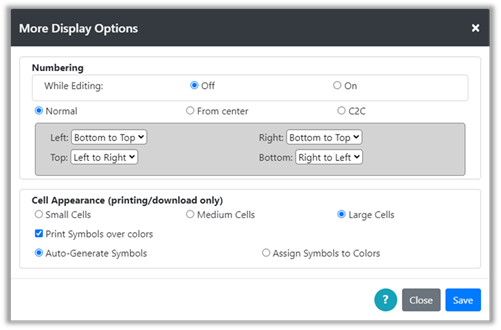
Figure 137 : More Display Options dialog
Numbering Options
The top section allows control over how row and column numbers appear. If the While Editing is turned off, the numbering will apply only to print and download. See the Print and/or Download sections for more information. If the While Editing is turned on, the numbering will show on the main display while you are editing.
To change the way numbering appears, the user may select either Normal, From Center or C2C numbering.
· Normal Numbering – with this numbering scheme, the user can select how they would like the row and column numbers to appear on each side of the grid.
· From Center – with this numbering scheme, numbers start from the center of each side and the center row is numbered with zero.
· C2C – this numbering scheme is provided for Corner2Corner crochet where the work is created starting from a corner of the diagram. The user can select the corner they wish to start numbering from when C2C is selected.
Click the Save button to save your selections.
Cell Appearance
The bottom section allows control over cell appearance for print/download. The checkbox ‘Print Symbols over colors’ will allow you to print symbols rather than colors on the printed chart. When print symbols is selected, more options will be shown.
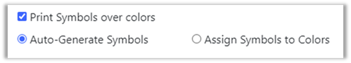
Figure 138 : Print Symbols
You may select either to Auto-Generate Symbols or Assign Symbols to Colors manually. If the Auto-Generate option is selected, then the Grid Designer will assign symbols to all colors and they will appear when you print or download your project.
When the Assign Symbols to Colors option is selected, you will be able to see all the colors currently used in your project and select symbols for any that you want.
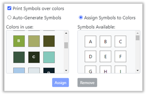
Figure 139 : Assign Symbols
To Assign a symbol to a color:
1) Select the color (left) you want to assign a symbol to.
2) Select the symbol (right) you want to assign to that color.
3) Click the Assign button to make the assignment. The symbol will then appear on the color square on the left.
4) If a color has already been assigned, you can select a different symbol by selecting the color again, selecting a different symbol and clicking the Assign button again.
To Remove a symbol from a color:
1) Select a color that has a symbol displayed on it (left).
2) Click the Remove button to remove the assignment. The symbol will then disappear from the color square on the left.
The assigned symbols will be saved with the current palette and will be used for every project that uses the currently selected palette. They are saved in browser local storage.
Click the Save button to save your selections.
Changing Cell Size/Type
The Cell Size/Type option in the Display menu displays the Change Cell Size dialog.
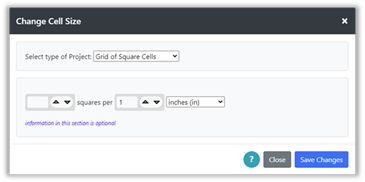
Figure 140 : Change Cell Size dialog
This dialog allows you to redefine your project type and/or the cell size of your grid. Its use is the same as described under the New Project option of the Project menu (See that section for details ).
Here are some situations where this might be useful:
a) Suppose you have been working on a cross-stitch project and you want to see the size of the project if you work your project on a different cloth with a different number of stitches per inch. You would select the different cloth here and view the size of your project in the Project à Project Info dialog.
b) You have been using the general knitting gauge to create your design, but you have now decided on a specific yarn and have knitted a sample swatch that you can use to determine the gauge of your project. You want to enter this information here and see how that changes your pattern size.
c) You have a pattern for a latch hook rug, but now you want to create a similar pattern for cross-stitch so that you can make a wall-hanging to match the rug. Open your latch hook project, do a Project > Save As to make a new place for the cross-stitch project. Then select Display > Cell Size/Type and change the type to cross-stitch; select the cloth type. Click on Save Changes. In this case you would likely want to select a different palette. You can select Project > Palette, then select something like DMC floss and click Use Palette and follow the instructions to convert to that palette.
Changing Grid Size
The Grid Size option in the Display menu allows you to add or subtract rows and columns from the edges of your grid. When you select the Grid Size option, the Grid Size dialog is displayed.
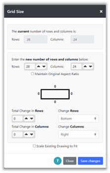
Figure 141 : Grid Size Dialog
At the top of the dialog the current number of rows and columns are shown. These values are fixed and are for reference as you select to add or delete columns in the next section of the dialog.
You can change the number of rows and columns in multiple ways, either by modifying the row and column totals directly, or by entering a change in rows or columns below.
If you want to maintain the aspect ratio of your project grid, click the Maintain Original Aspect Ratio Checkbox just under the Rows and Columns fields. When the checkbox is checked, any change you make to Rows will cause the number of columns to be calculated, and any change you make to Columns will cause the number of rows to be calculated. The calculation then maintains the aspect ratio of the original grid.
If the Maintain Original Aspect Ratio Checkbox is not checked, you are free to change both Rows and Columns to any value you wish as in the following example.
Example
Suppose we have a 20 x 20 grid and suppose we need to remove 5 columns from the left side of the grid. Enter -5 through typing or by clicking the down arrow 5 times in the “Total change in columns” field. This will reduce the number of columns by 5.
But we want the change to be on the left side, so, select Left from the “Change Columns” dropdown.
This will result in:
Now the 5 columns will be taken off of the left side of the grid. Click Save Changes to make the change to the grid.
Now suppose after working on our design, we would like to add 1 row and column to all sides of the grid. We open the Grid Size dialog again and reduce by 2 rows and 2 columns in total. Then select “Change Rows” to be Both Top and Bottom and “Change Columns” to be Both Left and Right.
Note that the diagram in the center shows what the final changes to the grid will be.
Click the Save Changes button to make the change to the grid.
In the example above we did not change any existing picture that might have been drawn on the grid before the number of rows and columns were changed. At the bottom of the Grid Size dialog is a checkbox labeled Scale Existing Drawing to Fit. When this checkbox is selected, any picture drawn on the original grid will be resized to the new number of rows and columns. That means it will be skewed or stretched to fit the new size grid. This feature can be used to resize any drawing you have on your grid.
If you have defined the project type and cell size, you will also be able to see the size of your grid in real-world units such as inches or centimeters. In this case the Grid Size dialog will show those units in addition to the number of rows and columns. As you change the number of rows and columns, the height and width of the project will be recalculated:

Figure 142 : Grid Size with real-world units
To define your project type and cell size, you must have created your project with either Project > New Project or Project > Create from Image and defined specific sizing information that references inches/cms/mms. Or, used the Display > Cell Size/Type to set that information for an existing project.
To enlarge or shrink your drawing and maintain aspect ratio:
1) Select Display à Grid Size; the Grid Size dialog will be displayed.
2) Check the Scale Existing Drawing to Fit checkbox at the bottom of the dialog.
3) Check the Maintain Original Aspect Ratio checkbox just under the Rows and Columns fields.
4) Change either the Rows or Columns value, the other value will be calculated.
5) When you have the size you want, click the Save Changes button.
6) The grid will be resized AND the picture will be rescaled to fit.
Rule Lines
The Rule Lines option on the Display menu allows you to draw solid lines at defined intervals on your grid. For instance, if a pattern repeats every 5 columns or rows, you may want to define rule lines that are every 5 columns or rows to aid in working on your design.
If you are ready to print your design, you can add rule lines to make it easier to keep your place in the pattern as you work from the printed copy by adding rule lines every 3 or 5 cells or so.
If you are working on a large grid, you may also want to turn off the main grid lines and draw rule lines instead, say every 2 or 3 cells. This can make it easier for you to view the colors on your grid, but still allow you to be able to tell what cells you are working on.
When you select the Rule Lines option from the Display menu, the Set Rule Lines dialog is displayed.
Figure 143 : Set Rule Lines Dialog
The default setting is None. You can select lines every 5, 10, or 20 cells and can also set a custom rule line spacing. Select the option you want from the dialog. If you select custom, enter the number of rows/columns to have between lines. Then click the Save button to update your grid.
Figure 144 : Rule Lines shown every 5 cells
Rotate Project Grid
You can rotate the entire project grid by ¼ turn to the right (90 degrees). Select Display > Rotate Grid 90 degrees to rotate the entire grid.
Refresh Display
Select Display > Refresh Display to redraw the grid display. When working with a very large grid that is zoomed out, sometimes shadows can appear in certain cases. This will redraw the grid and remove any shadows from recent editing. Short-cut for this is Alt + r.
Move Options
The display menu also contains 4 options to move the grid, up, down, right and left. Select the appropriate option as desired.
The grid may also be moved with the mouse, when no mode button is selected. If the mouse cursor is showing an open hand when moved over the grid, you can grab the grid and move it in any direction.
On a desktop computer, you can move the grid with the up, down, right and left arrow buttons. See the Keyboard shortcuts section for more information on keyboard shortcuts.
Zoom
You can zoom in and out to make the grid larger or smaller. There is also a full picture option to allow you to zoom the grid to the size where the entire grid can be seen in the current viewing window.
Zoom In/Out
The Zoom In and Out buttons are located on the top toolbar. Zoom In makes the grid larger (+), zoom out makes the grid smaller (-).
Zoom to Show All
The Zoom to Show All button is located to the right of the Zoom In and Zoom Out buttons on the top toolbar.
This button allows you to zoom out to the point where the entire picture is visible in the viewing window, then zoom back to the same place you were working. It is intended to aid in working with large projects, allowing the user to work on a small area of the grid, zoom to see how the whole picture looks, then zoom back to the small area they are working in.
To use the Zoom to Show All feature:
1) Click the Zoom to Show All button.
2) The grid will be resized to show the full picture in the given window space.
3) The Zoom to Show All button’s icon will be changed to add an undo arrow, as in the following figure:

4) If the button is clicked while it is showing the undo arrow, the grid will return to its original zoom state and placement.
Example
Example
In this example we are working on a design that is 200 x 200 cells. We are zoomed into a small area we are working on.
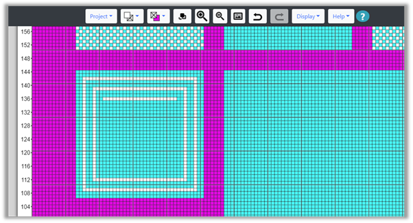
To see what this looks like when we view the entire picture, we click the Zoom to Show All button.
The designer zooms out to show the full picture and we see this:
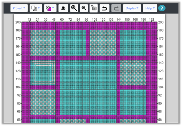
Turning off the dashed grid lines, we get a clearer view.

The dashed grid is off, we have Rule Lines showing every 20 cells. We want to zoom back to our original place, so we click the Zoom to Show All button again, as it now shows the undo arrow.
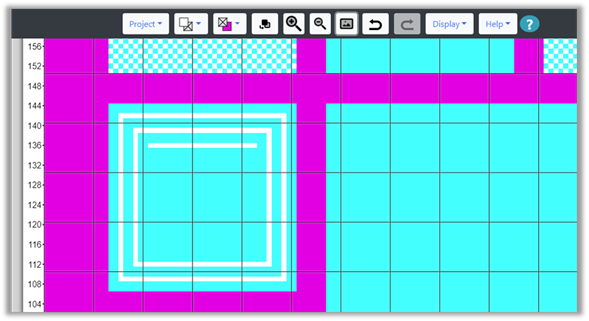
This returns the grid to its original position and zoom state. We can then turn the dashed grid lines back on to continue working.
Keyboard Shortcuts
Many of the actions you can take in the Grid Designer, can be executed with Keyboard Shortcuts. This is applicable if you are using a desktop computer. This section describes the Keyboard Shortcuts available.
Moving Grid and Paste Item
The up, down, right and left arrow keys can be used to move the entire grid up, down, right or left. They are useful when working on a large grid.
If the arrow keys are used while holding down the shift key, they will move the paste item up, down, left or right one cell.
The mouse wheel can be used to move the grid up and down. To move the grid right or left, hold the shift key down while moving the mouse wheel.
Zooming
If the arrow keys are used while holding down the Ctrl key, the up and down arrows will zoom the grid in and out.
Ctrl+up-arrow – zoom in
Ctrl+down-arrow – zoom out
If you want to zoom to show all and zoom back, then use either Ctrl+a or Alt+a.
Project Menu
· New Project – Alt+n
· Open Project – Alt+o
· Save Project – Alt+s or Ctrl+s
· Save As – Alt+w
· Print – Alt+p
· Show Project Info – Alt+i
Display Menu
Toggle Show/Hide Mouse Position – Alt+m
Toggle Show/Hide Numbering – Alt+u
Refresh Display – Alt+r
Top Toolbar Options
· Ctrl+z or Alt+z – Undo
· Ctrl+y or Alt+y – Redo
· Ctrl+a or Alt+a – Zoom to show all
Bottom Toolbar Options
· Ctrl+x or Alt+x – Cut
· Ctrl+c or Alt+c – Copy
· Ctrl+v or Alt+y – Paste
Miscellaneous
If the keyboard focus is in an input widget and the widget hold numeric values, then the up and down arrows will adjust the number up or down. The right and left arrows move the input cursor.
The spacebar will execute the Stamp button when the Paste Tools are visible.
The Delete or Backspace key will execute the Cancel Select Button.
Help Menu
The Help menu contains links to documentation and other areas that provide help for how to use the Grid Designer.
Documentation (HTML)
Selecting this option opens the main documentation web pages. https://www.freese-works.com/griddesigner/docs/GridDesignerDoc.htm
Documentation (PDF)
Selecting this option will open the documentation in PDF form. To download the pdf, after the PDF is opened, click the download button in the PDF toolbar to download a copy to your device.
https://www.freese-works.com/griddesigner/docs/Grid%20Designer.pdf
How To Articles
Selecting this option takes you to the How To category on my blog at freese-works.com.
https://www.freese-works.com/category/how-to/
YouTube Video Tutorials
Selecting this option takes you to my YouTube account where I am posting tutorials on how to use the Grid Designer.
https://www.youtube.com/channel/UCRgdJSQZkXXVyQrt7zfWWbg?view_as=subscriber
Facebook Page
Takes you to my Facebook page where I post links to interesting craft sites and articles.
https://www.facebook.com/agnes.freese.376
Blog Home
Takes you to freese-works.com home page. To see blog entries, click on the Get Started option.
Yarn Calculator
Allows you to convert from weight to length and vice versa, given the information on your yarn label. https://www.freese-works.com/griddesigner/yarnCalculator.html
Ratio Calculator
The ratio calculator helps when you are reducing or enlarging a rectangular area and you want to keep the aspect ratio of the rectangle the same. Directions for use appear on the Ratio Calculator dialog that appears when the option is selected.
Enable Hints
Selecting this option re-enables the hint dialogs that appear for Mode Buttons .
Reload
Selecting this causes a browser refresh. It is equivalent to pressing the browser’s refresh button. It can be used to make sure that the latest software is loaded in your browser.
About
Selecting this option takes you to information on the current release and lists recent updates that have been made. The release number is displayed as part of the About option on the Help menu.